Mz Pip
 (1000+ posts)
Send PM |
Profile |
Ignore
(1000+ posts)
Send PM |
Profile |
Ignore
|
Mon Feb-14-11 07:15 PM
Original message |
| Saphire
(1000+ posts)
Send PM |
Profile |
Ignore
|
Mon Feb-14-11 07:20 PM
Response to Original message |
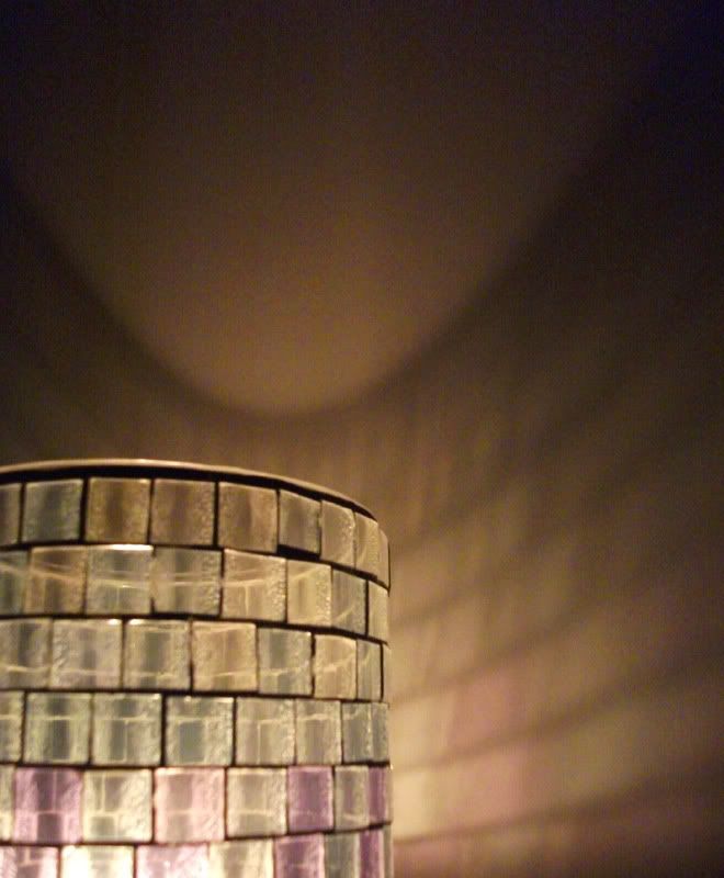
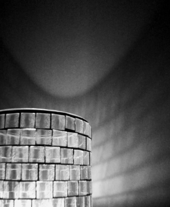
| 1. Color...it loses something in the b/w. |
| Celebration
(1000+ posts)
Send PM |
Profile |
Ignore
|
Mon Feb-14-11 09:24 PM
Response to Original message |
|
The top one is wonderful. Love it.
|
| CaliforniaPeggy
(1000+ posts)
Send PM |
Profile |
Ignore
|
Mon Feb-14-11 09:32 PM
Response to Original message |
| 3. I love the color one...way more vibrant! |
| Blue_In_AK
(1000+ posts)
Send PM |
Profile |
Ignore
|
Mon Feb-14-11 11:05 PM
Response to Original message |
| 4. I like the color one also |
|
because it's got color. :) Maybe if it didn't have that nice purple there at the bottom, the black and white would be okay, but I like the transition from the amber to the violet.
|
| handmade34
(1000+ posts)
Send PM |
Profile |
Ignore
|
Tue Feb-15-11 01:02 AM
Response to Original message |
| Solly Mack
(1000+ posts)
Send PM |
Profile |
Ignore
|
Tue Feb-15-11 06:47 AM
Response to Original message |
| 6. Color. It gives that added touch. |
| NV Whino
(1000+ posts)
Send PM |
Profile |
Ignore
|
Tue Feb-15-11 09:59 AM
Response to Original message |
|
But truthfully, I'm not wild about either. I think it might be the softness or lack of high contrast.
|
DU
AdBot (1000+ posts)     |
Wed Feb 11th 2026, 08:43 AM
Response to Original message |