| Latest | Greatest | Lobby | Journals | Search | Options | Help | Login |
|
|
|
This topic is archived. |
| Home » Discuss » The DU Lounge |
|
| RetroLounge
|
Sun Mar-16-08 08:41 AM Original message |
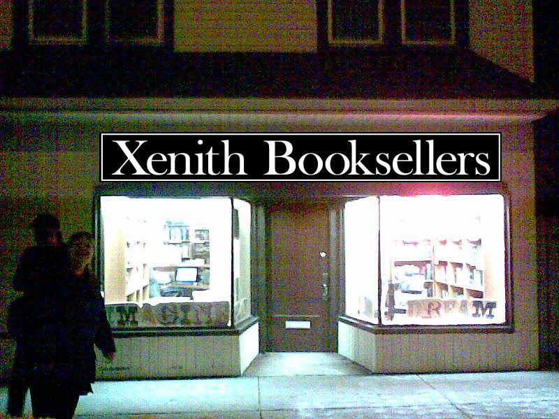
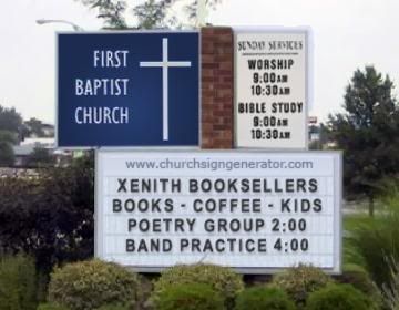
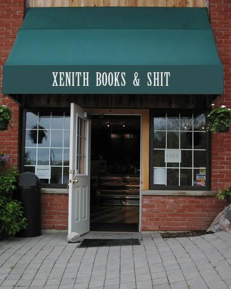
| Poll question: Xenith Booksellers Store Sign - A Poll... |
| Printer Friendly | Permalink | | Top |
| Guava Jelly
|
Sun Mar-16-08 09:02 AM Response to Original message |
| 1. I like this one |
| Printer Friendly | Permalink | | Top |
| RetroLounge
|
Sun Mar-16-08 09:08 AM Response to Reply #1 |
| 2. ... |
| Printer Friendly | Permalink | | Top |
| Guava Jelly
|
Sun Mar-16-08 09:15 AM Response to Reply #2 |
| 3. . |
| Printer Friendly | Permalink | | Top |
| Kutjara
|
Sun Mar-16-08 08:48 PM Response to Reply #1 |
| 40. Shouldn't that be "Bukcelarz"? n/t |
| Printer Friendly | Permalink | | Top |
| Ellen Forradalom
|
Sun Mar-16-08 09:17 AM Response to Original message |
| 4. how about this? |
| Printer Friendly | Permalink | | Top |
| RetroLounge
|
Sun Mar-16-08 09:27 AM Response to Reply #4 |
| 5. Nice! |
| Printer Friendly | Permalink | | Top |
| Ellen Forradalom
|
Sun Mar-16-08 10:43 PM Response to Reply #5 |
| 44. You haven't plumbed all the possibilities |
| Printer Friendly | Permalink | | Top |
| RetroLounge
|
Mon Mar-17-08 05:49 AM Response to Reply #44 |
| 45. "Xenith Books & Shit" |
| Printer Friendly | Permalink | | Top |
| Flaxbee
|
Sun Mar-16-08 09:59 AM Response to Original message |
| 6. for some reason, the third one makes my eyes cross a bit... |
| Printer Friendly | Permalink | | Top |
| hisownpetard
|
Sun Mar-16-08 12:49 PM Response to Reply #6 |
| 17. Me, too. Third one - NG. Second one is clearest, easiest to read. |
| Printer Friendly | Permalink | | Top |
| yvr girl
|
Sun Mar-16-08 10:04 AM Response to Original message |
| 7. Hi Retro |
| Printer Friendly | Permalink | | Top |
| RetroLounge
|
Sun Mar-16-08 12:08 PM Response to Reply #7 |
| 12. Yeah, I was 1 or 2. |
| Printer Friendly | Permalink | | Top |
| Cabcere
|
Sun Mar-16-08 10:40 AM Response to Original message |
| 8. Hey Retro |
| Printer Friendly | Permalink | | Top |
| Connonym
|
Sun Mar-16-08 10:49 AM Response to Reply #8 |
| 9. I agree that #3 is hard to read; however, |
| Printer Friendly | Permalink | | Top |
| graywarrior
|
Sun Mar-16-08 10:55 AM Response to Original message |
| 10. I love the name and I like 1 and 2. |
| Printer Friendly | Permalink | | Top |
| RetroLounge
|
Sun Mar-16-08 11:45 AM Response to Reply #10 |
| 11. Thanks... |
| Printer Friendly | Permalink | | Top |
| Gormy Cuss
|
Sun Mar-16-08 12:14 PM Response to Original message |
| 13. # 3 looks almost neon, thus not a good effect for a bookstore. |
| Printer Friendly | Permalink | | Top |
| RetroLounge
|
Sun Mar-16-08 10:20 PM Response to Reply #13 |
| 42. agree... |
| Printer Friendly | Permalink | | Top |
| Throd
|
Sun Mar-16-08 12:22 PM Response to Original message |
| 14. DO NOT GO WITH OPTION 3!!! |
| Printer Friendly | Permalink | | Top |
| RetroLounge
|
Sun Mar-16-08 04:01 PM Response to Reply #14 |
| 26. Well. The poll seems to agree. |
| Printer Friendly | Permalink | | Top |
| Rhythm
|
Sun Mar-16-08 12:23 PM Response to Original message |
| 15. Partial to #1 |
| Printer Friendly | Permalink | | Top |
| DarkTirade
|
Sun Mar-16-08 12:35 PM Response to Original message |
| 16. I voted #2, but #1 is a close second IMO. |
| Printer Friendly | Permalink | | Top |
| siligut
|
Sun Mar-16-08 12:54 PM Response to Original message |
| 18. #2. |
| Printer Friendly | Permalink | | Top |
| mitchum
|
Sun Mar-16-08 01:38 PM Response to Original message |
| 19. #2 |
| Printer Friendly | Permalink | | Top |
| hippywife
|
Sun Mar-16-08 01:46 PM Response to Original message |
| 20. I like them all, really, but |
| Printer Friendly | Permalink | | Top |
| Ellipsis
|
Sun Mar-16-08 01:47 PM Response to Original message |
| 21. #2 |
| Printer Friendly | Permalink | | Top |
| Oeditpus Rex
|
Sun Mar-16-08 01:52 PM Response to Original message |
| 22. The first one, but |
| Printer Friendly | Permalink | | Top |
| RetroLounge
|
Sun Mar-16-08 02:10 PM Response to Reply #22 |
| 23. Oooh, a bookier font? |
| Printer Friendly | Permalink | | Top |
| Oeditpus Rex
|
Sun Mar-16-08 03:00 PM Response to Reply #23 |
| 25. I found it |
| Printer Friendly | Permalink | | Top |
| harmonicon
|
Sun Mar-16-08 06:15 PM Response to Reply #25 |
| 35. yes, 1970's font!! |
| Printer Friendly | Permalink | | Top |
| Ellen Forradalom
|
Sun Mar-16-08 08:45 PM Response to Reply #35 |
| 39. Came standard with any phototypesetting machine |
| Printer Friendly | Permalink | | Top |
| Rhythm
|
Sun Mar-16-08 02:16 PM Response to Original message |
| 24. A little variation |
| Printer Friendly | Permalink | | Top |
| RetroLounge
|
Sun Mar-16-08 04:02 PM Response to Reply #24 |
| 27. 342 Views and only 58 Votes? Come On! |
| Printer Friendly | Permalink | | Top |
| lizziegrace
|
Sun Mar-16-08 04:16 PM Response to Reply #27 |
| 30. #2 |
| Printer Friendly | Permalink | | Top |
| deucemagnet
|
Sun Mar-16-08 04:14 PM Response to Original message |
| 28. #1 |
| Printer Friendly | Permalink | | Top |
| RetroLounge
|
Sun Mar-16-08 04:46 PM Response to Reply #28 |
| 31. I just took a quick look at the bookstores on MySpace |
| Printer Friendly | Permalink | | Top |
| Rhythm
|
Sun Mar-16-08 05:43 PM Response to Reply #28 |
| 32. The 'all caps' logos just feel... i dunno... |
| Printer Friendly | Permalink | | Top |
| Recursion
|
Sun Mar-16-08 04:15 PM Response to Original message |
| 29. 2. Trajan is my favorite font (nt) |
| Printer Friendly | Permalink | | Top |
| dembotoz
|
Sun Mar-16-08 05:55 PM Response to Original message |
| 33. number 1 |
| Printer Friendly | Permalink | | Top |
| SPKrazy
|
Sun Mar-16-08 06:02 PM Response to Original message |
| 34. Guess I'm in a uniquely small group |
| Printer Friendly | Permalink | | Top |
| harmonicon
|
Sun Mar-16-08 06:22 PM Response to Original message |
| 36. I like #1 |
| Printer Friendly | Permalink | | Top |
| RetroLounge
|
Sun Mar-16-08 09:32 PM Response to Reply #36 |
| 41. There is no sign now on the outside |
| Printer Friendly | Permalink | | Top |
| mondo joe
|
Sun Mar-16-08 06:25 PM Response to Original message |
| 37. I'd prefer font 2, but with all cap and then all lower case - XENITH booksellers |
| Printer Friendly | Permalink | | Top |
| libodem
|
Sun Mar-16-08 06:38 PM Response to Original message |
| 38. I like |
| Printer Friendly | Permalink | | Top |
| LibraLiz1973
|
Sun Mar-16-08 10:38 PM Response to Original message |
| 43. This is my personal favorite...... |
| Printer Friendly | Permalink | | Top |
| xchrom
|
Mon Mar-17-08 07:24 AM Response to Original message |
| 46. 1 -- but shouldn't you be in the window |
| Printer Friendly | Permalink | | Top |
| lizziegrace
|
Mon Mar-17-08 04:24 PM Response to Reply #46 |
| 51. That gets my vote! |
| Printer Friendly | Permalink | | Top |
| RetroLounge
|
Mon Mar-17-08 05:42 PM Response to Reply #46 |
| 53. I'm behind the door, naked. |
| Printer Friendly | Permalink | | Top |
| RetroLounge
|
Mon Mar-17-08 03:38 PM Response to Original message |
| 47. Kick |
| Printer Friendly | Permalink | | Top |
| flvegan
|
Mon Mar-17-08 03:40 PM Response to Original message |
| 48. Make the two Os in "Booksellers" look like boobs. |
| Printer Friendly | Permalink | | Top |
| DS1
|
Mon Mar-17-08 03:43 PM Response to Original message |
| 49. How about |
| Printer Friendly | Permalink | | Top |
| RetroLounge
|
Mon Mar-17-08 05:43 PM Response to Reply #49 |
| 54. Nice... |
| Printer Friendly | Permalink | | Top |
| TommyO
|
Mon Mar-17-08 04:21 PM Response to Original message |
| 50. I went with #1, I'm not a big fan of small caps |
| Printer Friendly | Permalink | | Top |
| NMDemDist2
|
Mon Mar-17-08 04:32 PM Response to Original message |
| 52. I like #3 only because I think "BOOKS" needs to large, larger, largest!! n/t |
| Printer Friendly | Permalink | | Top |
| fudge stripe cookays
|
Mon Mar-17-08 06:10 PM Response to Original message |
| 55. A DU friend? |
| Printer Friendly | Permalink | | Top |
| DU
AdBot (1000+ posts) |
Wed May 01st 2024, 06:45 PM Response to Original message |
| Advertisements [?] |
| Top |
| Home » Discuss » The DU Lounge |
|
Powered by DCForum+ Version 1.1 Copyright 1997-2002 DCScripts.com
Software has been extensively modified by the DU administrators
Important Notices: By participating on this discussion board, visitors agree to abide by the rules outlined on our Rules page. Messages posted on the Democratic Underground Discussion Forums are the opinions of the individuals who post them, and do not necessarily represent the opinions of Democratic Underground, LLC.
Home | Discussion Forums | Journals | Store | Donate
About DU | Contact Us | Privacy Policy
Got a message for Democratic Underground? Click here to send us a message.
© 2001 - 2011 Democratic Underground, LLC