The graph looking thing is an analemma. You've probably seen one before on a globe. It's basically a solar calendar. Tom Hank's character in Cast Away made one by tracing out where the sun hit a spot in his cave each day:

(A minor movie nit: wasn't his watch broken? Without a working timepiece he would not have been able to make an analemma as we will learn.)
So, if you were to take a picture of the sun at the same time every day it would trace out a pattern like so:
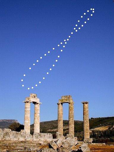
Everyone's aware that the sun rises higher in the sky during the summer than it does in the winter due to the Earth's axial tilt. That explains the motion in the long (north-south) axis. If that's all there were to it, the analemma would just be a straight line. But the Earth's orbit around the sun is elliptical rather than circular which means that the Earth's distance from the sun changes during the year. Oddly enough, we are actually closer to the sun during the winter months in the northern hemisphere:

When the Earth is closer to the sun, it moves faster in its orbit than it does when it's further away. And because the Earth is rotating in the same direction as it orbits the sun this means that the solar day (the time between successive local noons - when the sun is highest) is a little shorter in January than it is in July. But to make things simple, we define a day as 24 hours long every day when the actual solar day varies by +/- 16 minutes through out the year.
What this means is that when we take our picture of the sun at the same time of day according to our clocks sometimes the sun appears further along in its motion across the sky and sometimes it appears to be lagging. That's responsible for the east-west (horizontal) axis of the graph.
Every planet has its own unique analemma. For example, the Martian analemma look like this:

Turned out a bit longer than I expected, but that's only because it's really, really cool! Cheers!