(CNN) -- If beauty is indeed truth, as John Keats claimed, then this story ought to be true: the logo on the back of your iPhone or Mac is a tribute to Alan Turing, the man who laid the foundations for the modern-day computer, pioneered research into artificial intelligence and unlocked German wartime codes.
His death, a decade after the end of the war, provides the link with Apple. Unrecognized for his work, facing jail for gross indecency and humiliated by estrogen injections intended to 'cure' his homosexuality, he bit into an apple he had laced with cyanide. He died in obscurity on June 7, 1954, 10 years and a day after the Normandy landings, which made copious use of intelligence gleaned by his methods.
And so, the story goes, when two Stanford entrepreneurs were looking for a logo for their brand new computer company, they remembered Turing and his contribution to their field. They chose an apple -- not a complete apple, but one with a bite taken out of it.
Sadly, the truth is rarely as simple, or beautiful, as we would like.
more
http://edition.cnn.com/2011/10/06/opinion/apple-logo/CNN couldn't google?
 http://www.edibleapple.com/2009/04/20/the-evolution-and-history-of-the-apple-logo/
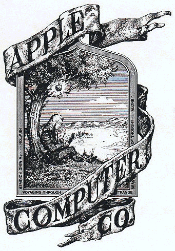
The Newton Crest: 1976-1976
The first Apple logo was designed in 1976 by Ronald Wayne, sometimes referred to as the third co-founder of Apple. The logo depicts Isaac Newton sitting under a tree, an apple dangling precipitously above his head. The phrase on the outside border reads, Newton
A Mind Forever Voyaging Through Strange Seas of Thought
Alone.
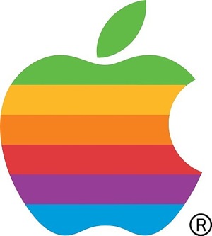
The Rainbow Logo: 1976-1998
Not surprisingly, the above logo only lasted a year before Steve Jobs commissioned graphic designer Rob Janoff to come up with something, oh I dont know, a little bit more modern. Janoffs eventual design would go on to become one of the most iconic and recognizable corporate logos in history.
According to Janoff, the bite in the Apple logo was originally implemented so that people would know that it represented an apple, and not a tomato. It also lent itself to a nerdy play on words (bite/byte), a fitting reference for a tech company. Quick sidenote: Corporate design sure was a lot simpler in the 70s. Nowadays, companies like Pepsi spend millions of dollars on logo re-designs that are based on complete BS and new age mumbo jumbo.
(snip)
The relatively simple origins of the rainbow colored Apple logo hasnt stopped some from reading a bit too much into what it represents. Jean-Louis Gassée, former Apple executive and founder of BeOS, quipped about the logo:
One of the deep mysteries to me is our logo, the symbol of lust and knowledge, bitten into, all crossed with the colors of the rainbow in the wrong order. You couldnt dream a more appropriate logo: lust, knowledge, hope and anarchy.more
http://www.edibleapple.com/2009/04/20/the-evolution-and-history-of-the-apple-logo/