General Discussion
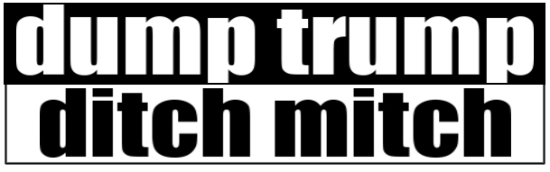
Related: Editorials & Other Articles, Issue Forums, Alliance Forums, Region ForumsI'm going to print 1,000 of these stickers and have to decide between 2 designs. Which?
I'm going to print 1,000 of these stickers and have to decide between 2 designs. Which one do you like better?
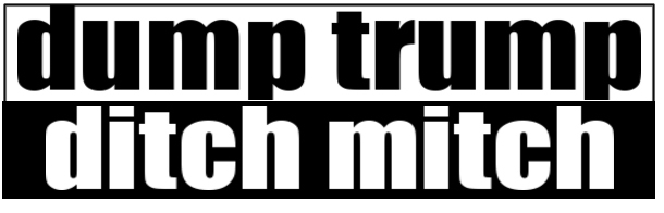
or....
 = new reply since forum marked as read
Highlight:
NoneDon't highlight anything
5 newestHighlight 5 most recent replies
= new reply since forum marked as read
Highlight:
NoneDon't highlight anything
5 newestHighlight 5 most recent replies

boston bean
(36,945 posts)mr_lebowski
(33,643 posts)
real Cannabis calm
(1,124 posts)Like billboards, bumper stickers must be read at a glance, by other drivers and feature a central concept.
Simply printing DUMP TRUMP would be far more effective.


50 Shades Of Blue
(11,445 posts)
True Blue American
(18,579 posts)For some reason the white stands out
dalton99a
(94,749 posts)
catrose
(5,371 posts)bluestarone
(22,325 posts)
Hoyt
(54,770 posts)jberryhill
(62,444 posts)
roody
(10,849 posts)
blm
(114,702 posts)
MoonRiver
(36,975 posts)
MineralMan
(151,430 posts)Black on white is more quickly processed by the brain. Then, the white on black will be read more easily.
Put the black on white on the top, since people read left to right, top to bottom.

Renew Deal
(85,273 posts) ?
?lame54
(39,901 posts)
PoindexterOglethorpe
(28,493 posts)It looks as if the opinions here are about equally divided, so do both.

garybeck
(10,086 posts)there is a big difference in price when i order more of the same design.
i'm hoping i need to do a 2nd printing at some point; i'm going to sell them for $2 each or $1 each if you buy a bunch.
KY_EnviroGuy
(14,793 posts)to better get the deplorable's attention and really piss them off......

kentuck
(115,473 posts)Too complicated to explain why? 

Lochloosa
(16,764 posts)I really shouldn't drink this early on a Sunday. 
bobbieinok
(12,858 posts)Demovictory9
(37,113 posts)not_the_one
(2,227 posts)Dump TrumPutin
Ditch Moscow Mitch
and possibly throw in something about Leningrad Lindsey... Don't know what the verb should be.
and the white areas would be red. (still only paying for two colors, but my partner just pointed out the white would be the paper, so cheaper...  )
)
Now they are literally tied to Russia.
Unless the turd supporters won't get "TrumPutin"... They are not very bright.

otherwise, #1

shanti
(21,801 posts)ariadne0614
(2,185 posts)
LiberalFighter
(53,544 posts)
marybourg
(13,653 posts)old eyes.

riversedge
(81,194 posts)NightWatcher
(39,378 posts)violent.

demmiblue
(39,846 posts)Meadowoak
(6,606 posts)
Takket
(23,749 posts)
backtoblue
(13,210 posts) 
sellitman
(11,745 posts)

southerncrone
(5,510 posts)
Maru Kitteh
(31,881 posts)
sell me a half dozen!
Phoenix61
(18,856 posts)northoftheborder
(7,637 posts)The white against black with "dump trump" fills up more space with more letters than the top one and so seems dominant to the eye.

rickford66
(6,078 posts)
nocoincidences
(2,491 posts)homegirl
(1,973 posts)DUMP TRUMP is heavier impact and more balanced.
How will you be distributing these stickers?
I found a source on the internet with instructions on How to Make Your Own Bumper Stickers, if you want to expand to bumper stickers.
GREAT IDEA ---GOOD LUCK!

cp
(8,333 posts)zackymilly
(2,375 posts)MarcA
(2,195 posts)The top to bottom flow for #2 is better for me.

James48
(5,244 posts)I almost couldn’t read the top one.
Ligyron
(8,006 posts)Not criticizing, just saying. I think that format is available on here? Then you don't have to do all that tedious counting.
Door number 1.

BadGimp
(4,109 posts)That way the emphasis will be on #MoscowMitch
DallasNE
(8,018 posts)So one if Dump Trump or two if Ditch Mitch is the primary goal.

DemocracyMouse
(2,275 posts)You need to make more space around the letters and otger subtke tweaks. Hire someone who went through 4 years of graphic design training?

secondwind
(16,903 posts)
PatrickforO
(15,474 posts)BigBearJohn
(11,410 posts)
handmade34
(24,027 posts)

somaticexperiencing
(598 posts)
chowder66
(12,371 posts)
Mr.Bill
(24,906 posts)That one is not an easy read for something someone must read quickly and maybe from a distance.
(I'm assuming it's a bumper sticker)
garybeck
(10,086 posts)Impact's thick letters were designed to stand out. from the beginning, Impact was valued for its legibility
https://www.vox.com/2015/7/26/9036993/meme-font-impact
oasis
(53,791 posts)

BarbaRosa
(2,730 posts)Thekaspervote
(35,820 posts)I like them both
garybeck
(10,086 posts)it's not worth it for me to print 100 really.

womanofthehills
(10,998 posts)chillfactor
(7,694 posts)Hermit-The-Prog
(36,631 posts)Ditching rich Moscow Mitch needs to be the bolder message because he's evil, conniving, and knows how to manipulate the rules. Everybody knows Trump is the dump who needs to be dumped.

applegrove
(132,628 posts)
Rhiannon12866
(256,995 posts)What you have works very well just as it is! 