General Discussion
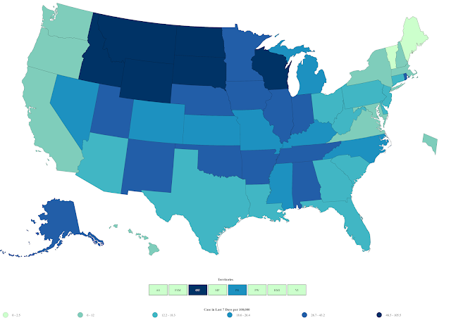
Related: Editorials & Other Articles, Issue Forums, Alliance Forums, Region ForumsCOVID-19 Cases per 100,000 Map. Per capita numbers tell the true story.
https://covid.cdc.gov/covid-data-tracker/#cases_casesper100klast7daysHere is a color coded map from the CDC, showing the number of cases of COVID-19 in the past 7 days, measured in cases per 100,000 people in the population.
This is a key infection rate number, and balances the difference between densely populated states and less densely populated states. Lookin just at total numbers of cases does not show a true picture of the impact of the pandemic on the population in various places. Per capita infection rates are far more indicative of how well a state is protecting its population through preventive measures.
As you look at the map, you will immediately notice that the Pacific coast states and the states in the Northeast have the lowest per capita infection rates over the past two days. Notably, those states are all pretty much Democratic states.
Then, look at the darkest blue colors, which indicate higher per capita infection rates. States in the upper Midwest are showing the largest block of high infection rates. The states in dark blue are all deeply red states.
This is the true story of the COVID pandemic in the United States. This is Trump's legacy. I strongly urge everyone to study this map.
The map is posted below. To see a full-size version, with readable details, click the link above.
 = new reply since forum marked as read
Highlight:
NoneDon't highlight anything
5 newestHighlight 5 most recent replies
= new reply since forum marked as read
Highlight:
NoneDon't highlight anything
5 newestHighlight 5 most recent replies

tblue37
(68,447 posts)
Buckeye_Democrat
(15,532 posts)Otherwise it's like arguing for Trump, testing less to lower the numbers.
Pennsylvania recently had twice the rate of positive tests (10%) compared to Ohio (5%), but PA's new cases per 100,000 population was lower because they tested about ONE THIRD the amount of people compared to Ohio -- i.e., tests per 1000 people.

MineralMan
(151,495 posts)I consider actual infections per capita to be the best measure. That's why I posted the map. Its regional depiction is striking.
Buckeye_Democrat
(15,532 posts)Yet I still prefer positivity rate, which would also show up strongly for that area if that's what the map used instead.
MineralMan
(151,495 posts)Buckeye_Democrat
(15,532 posts)And they were the least-tested state in the country, so they look somewhat normal in the cases per 100,000 map.
Just sayin'.
Buckeye_Democrat
(15,532 posts)... yet Wisconsin is testing about three times as many people per 1000 population, so Wisconsin looks worse.
It's not directed just at you. I hate how the NYT focuses on new cases per 100,000 too. It can provide incentive to test less, not more.

StarryNite
(12,160 posts)
Grasswire2
(13,849 posts)This helps with my family member who is questioning the data as "fake news"
Layzeebeaver
(2,290 posts)The rest of the cdc site seems to work.
Accessing it from the U.K. but via New York VPN.
MineralMan
(151,495 posts)Buckeye_Democrat
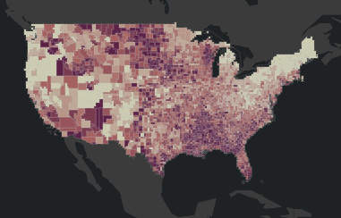
(15,532 posts)I think this one is based on positivity rates around the country, but I'm not sure. That seems to be the main concern of JH and the WHO, anyway.
https://coronavirus.jhu.edu/us-map
It takes 'forever' to load for me, so here's a screenshot:

GoCubsGo
(34,983 posts)It's barely available here in much of South Carolina. I am sure that holds true for every state with a Republican legislature.
Pobeka
(5,008 posts)They combine a number of factors, cases/100k, positivity rate, ICU capacity, to get a score for a state. You will see that on the first screen.
If you click on a state, it will show you the counties, with a similar scoring system coloring the counties -- for which you can then click on a county of interest to see the actual numbers.
The folks doing the science/stats for the epidemiolgy are doing it very well, IMHO (I'm not affiliated).
The general story is the same as you see on the CDC map you posted...

My Pet Orangutan
(12,598 posts)I may not know much, but I know that's crazy wrong. Patients are going into a field hospital in Milwaukee.
Pobeka
(5,008 posts)So any errors in Wisconsin's reporting will show up at covid act now, just as those errors will show up at the CDC, John's Hopkins, etc.
To make matters worse (to your point), if you look at Milwaukee county at covid act now you'll see the COVID19 patients are estimated to have only used 30% of the capicity above normal available capacity..

Niagara
(12,063 posts)Bookmarked.
smirkymonkey
(63,221 posts)Kind of what I would have expected, but what is up with Rhode Island? They are pretty much an outlier in New England and even the North Atlantic States. I sometimes read the Boston Globe, but I haven't really heard much in the news about RI.

Yeehah
(6,605 posts)I'm sure that's just a coincidence.
