Welcome to DU!
The truly grassroots left-of-center political community where regular people, not algorithms, drive the discussions and set the standards.
Join the community:
Create a free account
Support DU (and get rid of ads!):
Become a Star Member
Latest Breaking News
Editorials & Other Articles
General Discussion
The DU Lounge
All Forums
Issue Forums
Culture Forums
Alliance Forums
Region Forums
Support Forums
Help & Search
General Discussion
Related: Editorials & Other Articles, Issue Forums, Alliance Forums, Region Forums"Brave and fearless" Viva Magenta named Pantone Color of the Year 2023
https://www.dezeen.com/2022/12/02/viva-magenta-pantone-colour-year-2023/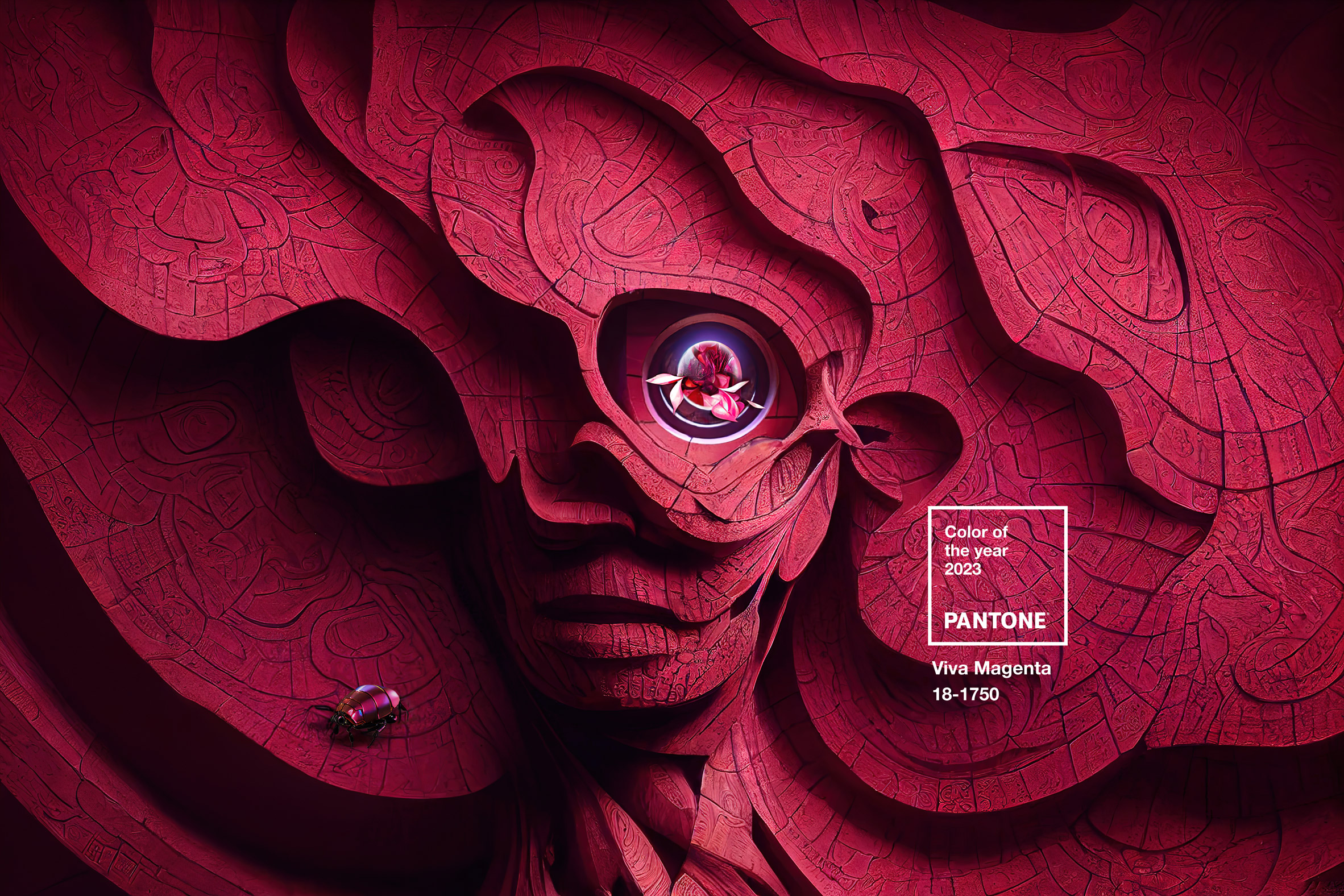

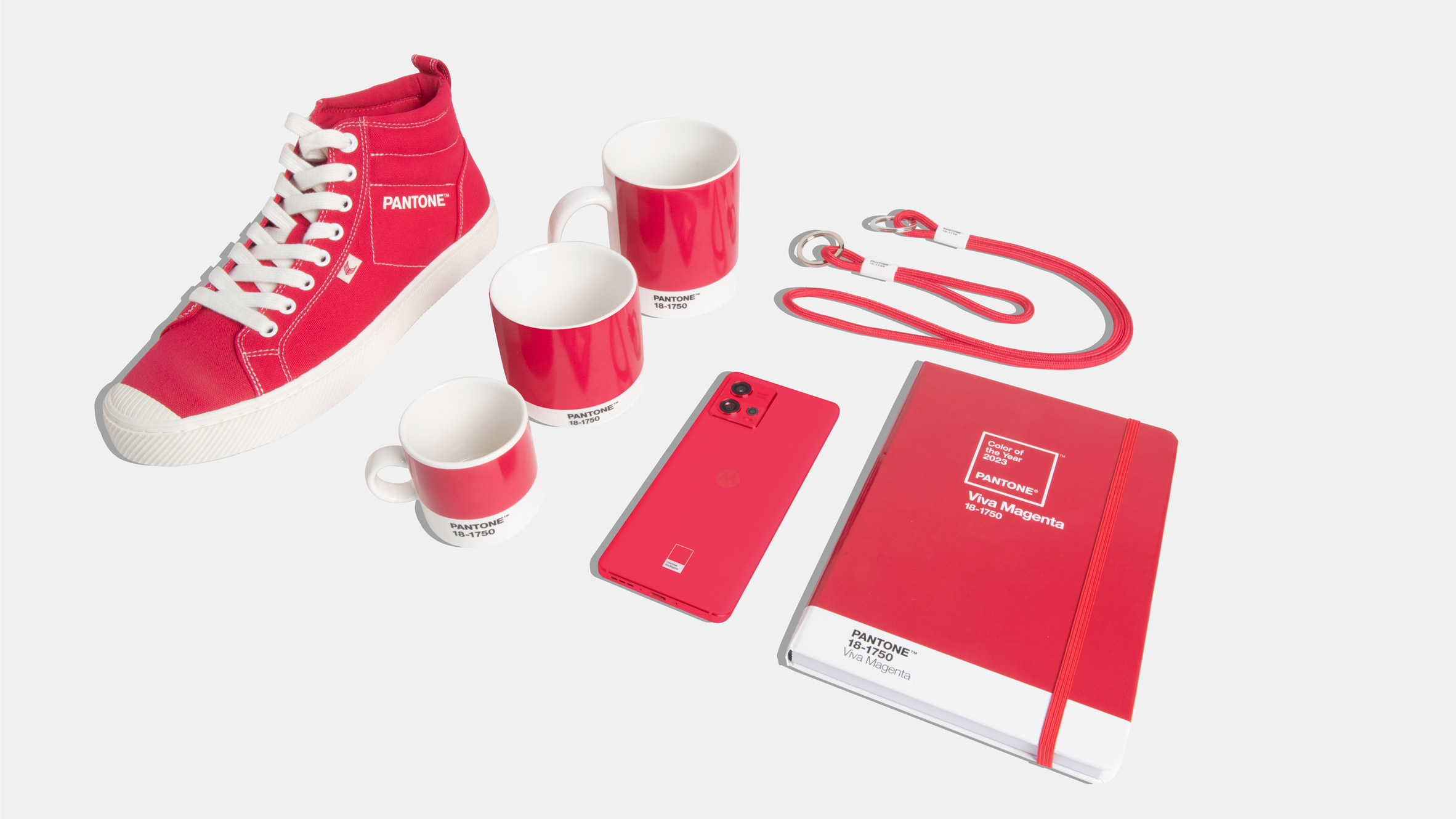

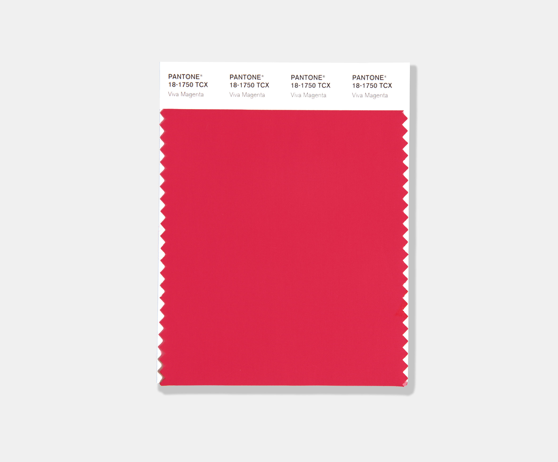
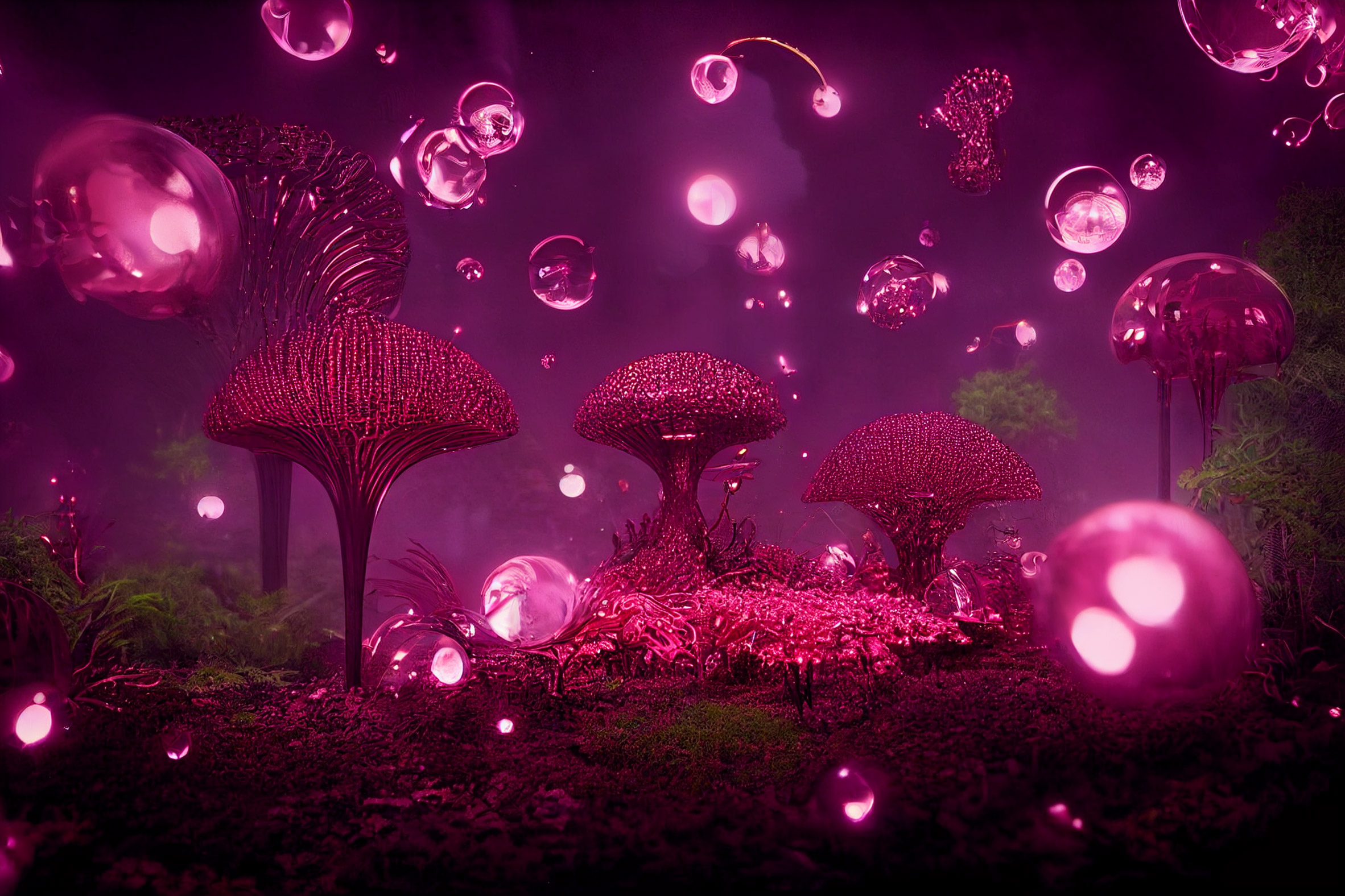
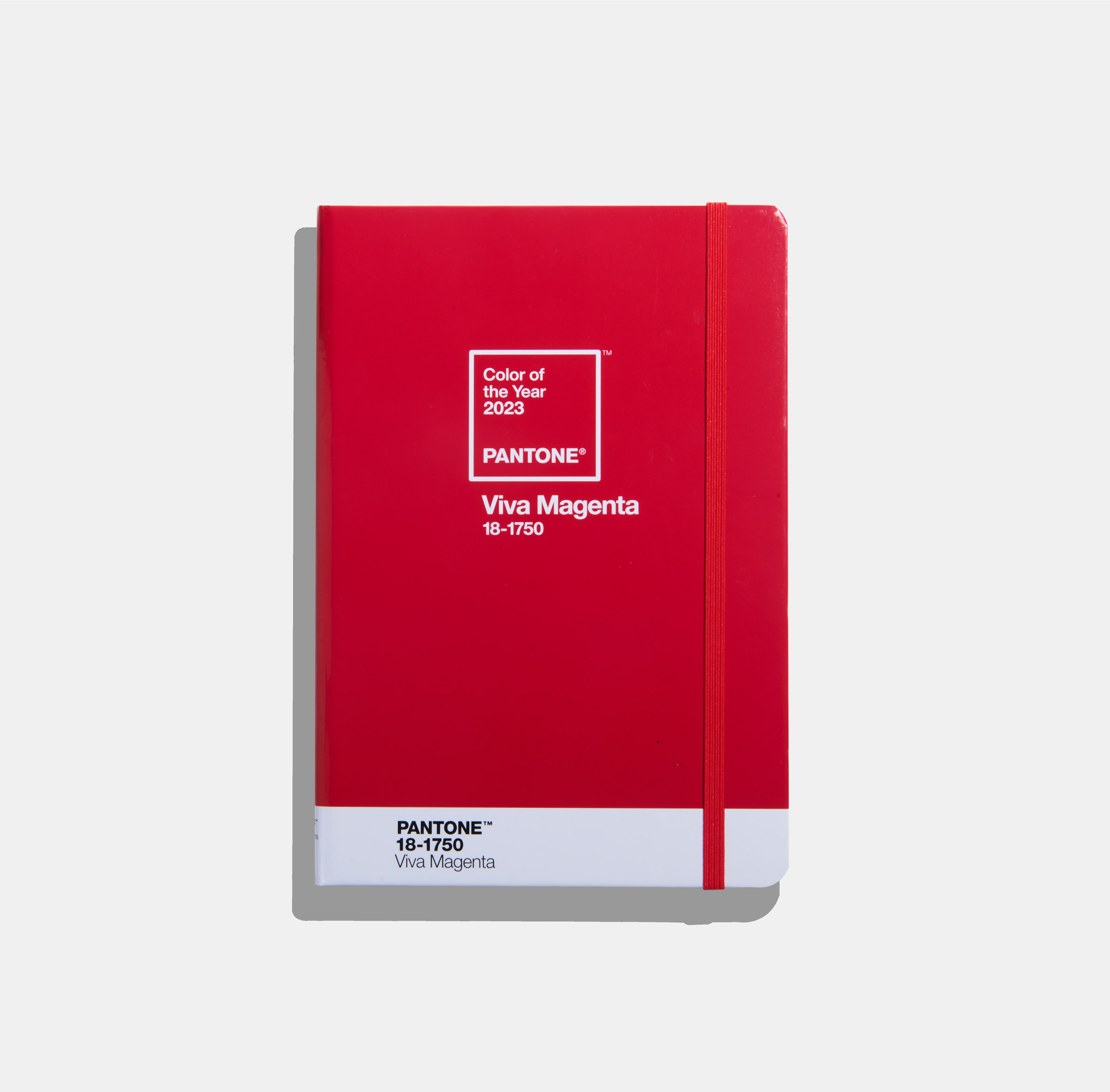
A hot pink called Viva Magenta that is reminiscent of blush has been named as 2023 colour of the year by the American colour company Pantone. Described by the brand as "an unconventional red for an unconventional time", Pantone's Viva Magenta 18-1750 is a vibrant pinky colour with hints of purple that belongs to the red colour family. "It's assertive but it's not aggressive – we refer to it as a fist in a velvet glove," said vice president of the Pantone Color Institute Laurie Pressman. "It's a brave and fearless red shade that vibrates with vim and vigour," Pressman told Dezeen. "Its exuberance promotes optimism and joy."
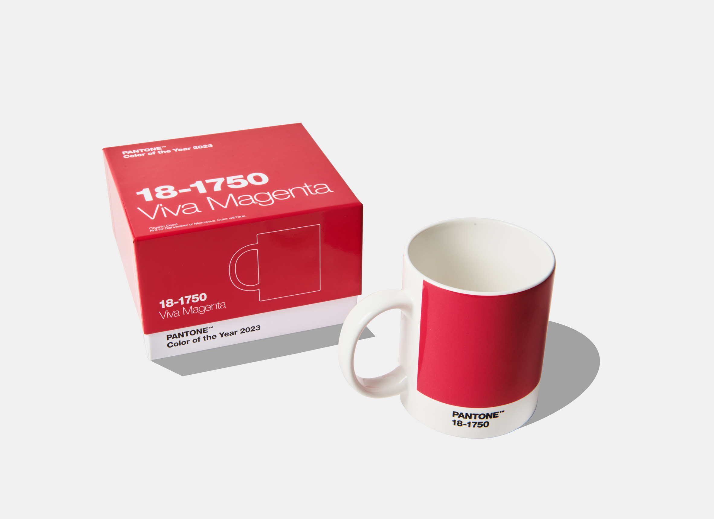
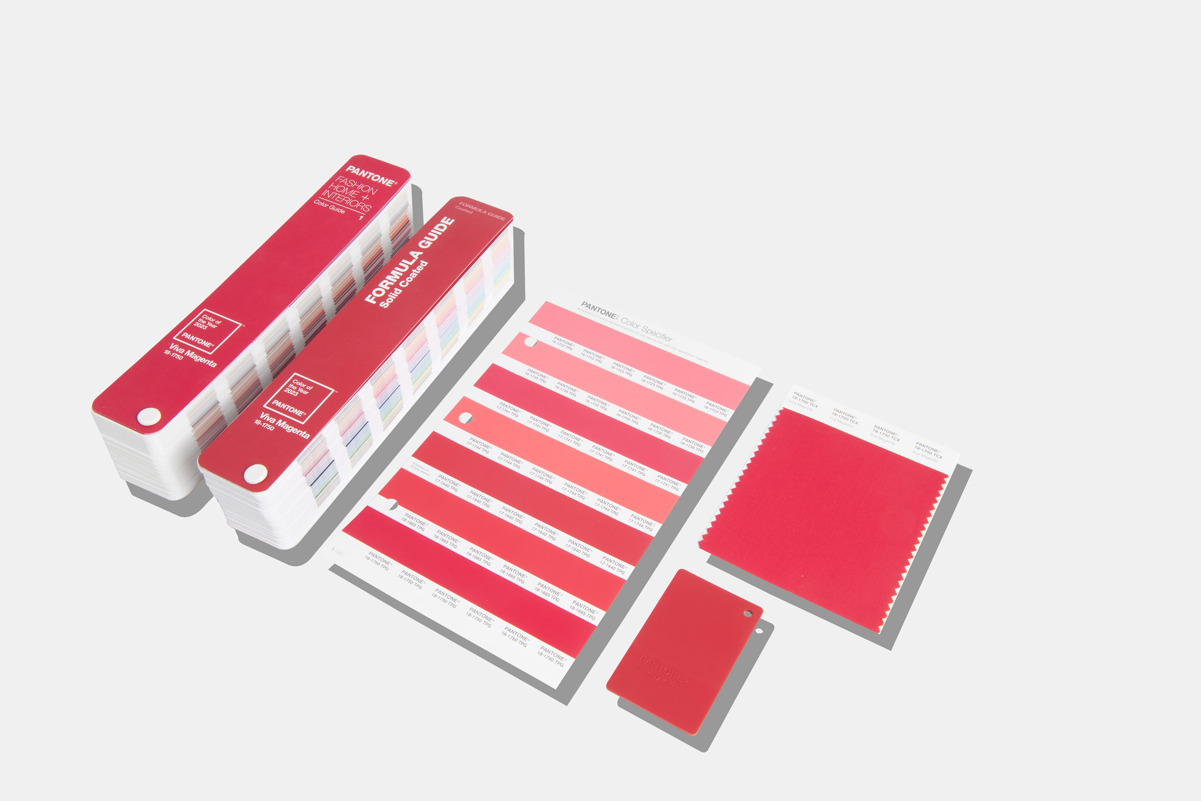
Pantone's trend-forecasting research department the Pantone Color Institute selects the colour each year. It said that this year's colour choice reflects the "rebellious" spirit of the time and the renewed interest in creative experimentation following the coronavirus pandemic. "Audacious, witty and inclusive of all, Pantone 18-1750 Viva Magenta welcomes anyone and everyone with the same rebellious spirit," said the brand. "Powerful and empowering, it is an animated red that encourages experimentation and self-expression without restraint; an electrifying, boundaryless shade that is manifestly 'out there' and is a stand-out statement."


According to Pantone Color Institute's research, magenta pinks are already popular among the fashion and beauty community. It expects the interior world to follow suit. Earlier this year, Italian fashion house Valentino released a magenta pink coloured fall/winter collection and models have been wearing similar shades on their eyelids and lashes.
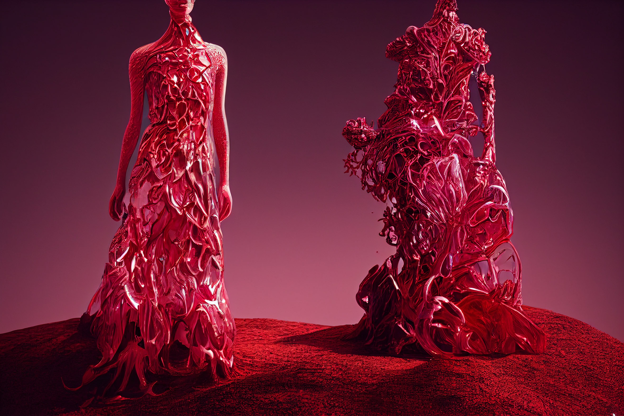
"It's a great colour for reflecting light, which gives it a sense of fantasy and glamour," trend forecaster and Pantone Color Institute member Jane Boddy said. "It's so flattering across all skin tones and all genders." "Traditionally you would imagine this be a colour for the lips or the cheeks whereas now we're seeing it as a solid eye colour in a painterly stroke," Boddy added.
snip


8 replies
 = new reply since forum marked as read
Highlight:
NoneDon't highlight anything
5 newestHighlight 5 most recent replies
= new reply since forum marked as read
Highlight:
NoneDon't highlight anything
5 newestHighlight 5 most recent replies
= new reply since forum marked as read
Highlight:
NoneDon't highlight anything
5 newestHighlight 5 most recent replies
"Brave and fearless" Viva Magenta named Pantone Color of the Year 2023 (Original Post)
Celerity
Dec 2022
OP
Is it just me or do none of the stunning images match the plain ol' red I see on the swatch?
FailureToCommunicate
Dec 2022
#1
some are different shades of magenta pinks, as the article discusses, and the swatch is not
Celerity
Dec 2022
#2
Colour balance & monitor calibration affect images differently, in addition to Celerity's point
Bernardo de La Paz
Dec 2022
#7

FailureToCommunicate
(14,620 posts)1. Is it just me or do none of the stunning images match the plain ol' red I see on the swatch?


Celerity
(54,866 posts)2. some are different shades of magenta pinks, as the article discusses, and the swatch is not
plain ol' red

William Seger
(12,529 posts)3. Very confusing, ain't it (nt)
Silent3
(15,909 posts)5. That's just slightly bluer than red
Hardly what I'd call "magenta".
The model's outfit is a real magenta, but way far off from "viva magenta".
Celerity
(54,866 posts)8. The model is Zendaya, one of the most famous actresses on the planet
The model's outfit
Also that colour is not Viva Magenta (as the article says)
it is a pink magenta called Valentino Pink PP, designed by Pierpaolo Piccioli, the creative director of Valentino for almost 15 years
https://www.valentino.com/en-th/experience/valentino-pink-pp-fall-winter-2022-collection
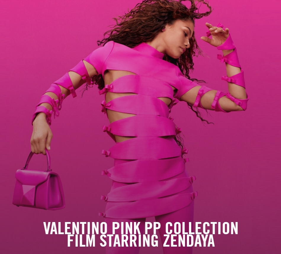
For Valentino’s latest advertising campaign, Zendaya finds herself in the vibrant, monochromatic world of #ValentinoPinkPPCollection
For the story, the Valentino Di.Va is propelled into the surreal, saturated by Pierpaolo Piccioli’s signature Pink PP shade and set to the sound of Yazoo’s “Only You.”
Discover the story, with cinematography by Marcell Rév, online at Valentino.com

Bernardo de La Paz
(60,320 posts)7. Colour balance & monitor calibration affect images differently, in addition to Celerity's point
There are special monitor calibrators that can be used and serious photographers do use them.
Then there is also the issue of the colour spaces that individual images may be contained in, part of the data that rides along with the image. Some monitors display more complete regions of the spaces. When colours are highly saturated like this version of magenta they are at the edges of colour spaces and may get clipped.

Silver Gaia
(5,431 posts)4. Yeah, that color is not red. Nice!
I like it a lot. Thanks, Celerity.

Ferrets are Cool
(23,047 posts)6. Some astounding images.


Kick in to the DU tip jar?
This week we're running a special pop-up mini fund drive. From Monday through Friday we're going ad-free for all registered members, and we're asking you to kick in to the DU tip jar to support the site and keep us financially healthy.
As a bonus, making a contribution will allow you to leave kudos for another DU member, and at the end of the week we'll recognize the DUers who you think make this community great.