General Discussion
Related: Editorials & Other Articles, Issue Forums, Alliance Forums, Region ForumsWhy DU3's home page was a better design for a Democratic community than DU4's. The news and our responses.
This discussion thread was locked by EarlG (a host of the General Discussion forum).
Last edited Thu Feb 29, 2024, 10:41 AM - Edit history (1)
EDIT: THIS OP IS MORE THAN 4 MONTHS OLD NOW, FEBRUARY 29, BUT APPEARED ON THE LATEST PAGE BECAUSE OF THE 75TH REPLY BELOW, A MILESTONE REPLY. BECAUSE OF CHANGES MADE TO DU4, THIS DISCUSSION IS NO LONGER RELEVANT, SO PLEASE DO NOT POST NEW REPLIES. WHOEVER YOU REPLY TO NOW WILL GET A POSTS NOTIFICATION, BUT THE THREAD WILL NOT BE KICKED.
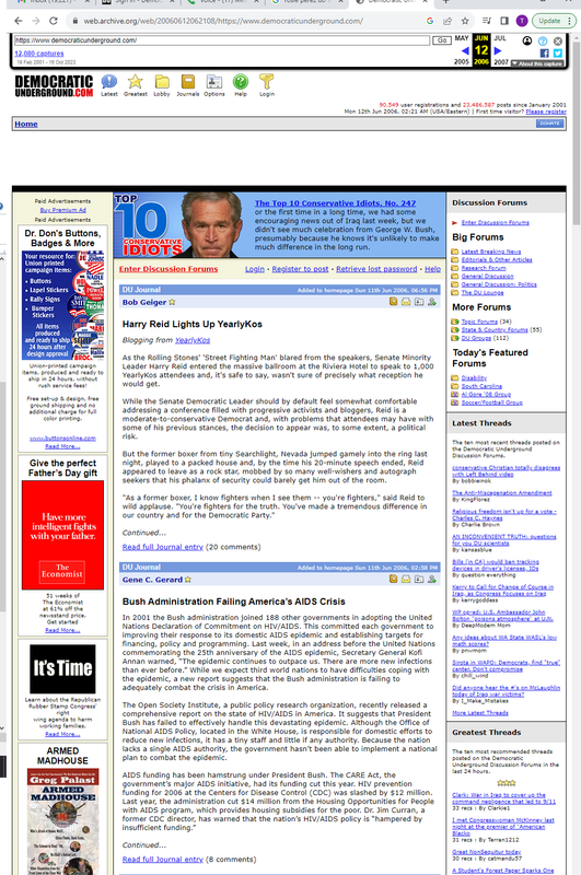
I can't post a screenshot of DU's old home page, but I can link to one at the Internet Archive: https://web.archive.org/web/20231016063621/https://democraticunderground.com/
It looks a bit odd to me because of the large blank spaces, typically filled with ads for those who are't Star members - ads and blank spaces I never saw if I was logged in - but it still illustrates something very basic about DU that DU4's design seems to have lost sight of.
DU is all about the news.
The news, and our response to it, and our favorite commentators' responses to it - both text and videos.
DU's most important function, for many here, is as a news aggregator, and a place to put that news in perspective.
The top LBN stories at the top of the home page were always the first thing I skimmed down when I logged in.
Trending Now and Greatest Threads, to the left of the LBN column, would usually give me a quick sense of how DUers were responding (with some more personal messages mixed in). The column of videos to the right typically included commentary from favorite pundits as well as additional news stories.
It was like a snapshot of DUers looking at and reacting to the world, and sharing others' reactions. You could get an instant sense of how things were going.
The Left Column and all the most recent threads from various forums are too prominent now and were better placed well down the page, as they were on DU3.
And that righthand column of most recent videos on DU3 worked much better and conveyed more at a glance than the scattered videos in the right column now.
LBN stories on the home page need the sources and especially the snippets - not just the headlines that are all that's showing up now, at least for some people on DU4.
But most of all, they need to be central, and at the top of the page. Many of us count on DU to have the latest breaking news of importance to Dems at the top of the page. And it shows newcomers where our focus has always been.
On the news that concerns Democrats, and the various reactions to that.
Not just whatever threads happen to be in The Left Column at that moment.
Please put the home page back the way it was with DU3.
 = new reply since forum marked as read
Highlight:
NoneDon't highlight anything
5 newestHighlight 5 most recent replies
= new reply since forum marked as read
Highlight:
NoneDon't highlight anything
5 newestHighlight 5 most recent replies
MOMFUDSKI
(7,080 posts)a HOMEPAGE? I do think it would attract newbies. Make it colorful and fun.

madinmaryland
(65,729 posts)MOMFUDSKI
(7,080 posts)Ye olde homepage.

edisdead
(3,396 posts)There is a lot going on in an upgrade.
highplainsdem
(62,143 posts)Which is why I'm mentioning it now.
edisdead
(3,396 posts)You?
The devs are working through a major upgrade and we don’t even know for sure if there is going to be a home page anymore. There may be or maybe not. But there was a lot for them to work on today and track down.
highplainsdem
(62,143 posts)Here it's https://www.democraticunderground.com .
It just doesn't work well as a home page with DU4. And it's the very first thing people see when they visit DU, unless someone's bookmarked a link to another page like the log-in page.
So it's important that it works well.
DU3's did.
DU4's home page puts the emphasis on The Left Column and buries Latest Breaking News.
In all my years on DU, I've seen countless messages about how important the LBN stories on the home page are to DUers.
I've never seen anyone say their main interest when they check DU is The Left Column.
edisdead
(3,396 posts)Thanks. Been a programmer of web apps and sites for 20 yrs. Yes I understand the index page at the site root or where the DNS entry sends you.
So given that our site admins also understand these concepts I’d say they are either busy with other issues at the moment (keeping the largest traffic driver up and running) or they have differing ideas on what they want to do.
edisdead
(3,396 posts)Don’t you think that the home page gets maintained by someone? Perhaps the same people that are debugging currently?
highplainsdem
(62,143 posts)anyone say they like DU4's home page. I have seen complaints about it.
edisdead
(3,396 posts)Possibly the people that are debugging issue right now? Someone probably has to place the content on the homepage, however if they have to do other things, the perhaps that is keeping them from updating it. I can see that there is an “in the forums” type feed right now that is auto generated from content.
Maybe we could get an AI bot to update the home page for ya?
highplainsdem
(62,143 posts)months, is more important than the design of the home page?
edisdead
(3,396 posts)Ok let me give you an example. Let’s say i side your code there are all sorts of page includes and linked files such as style sheets, scripts, and other things that need to be brought into the page in order to work correctly. And being a website you have many pages (files) that comprise your entire site. The big day comes around for rollout and you’ve been operating in the dev environment. You got everything staged to go to prod environment. Updated all your config files, set all the database connection credentials. And modified those external resource links to point where you need them…. Except it is entirely possible to leave one or two out because it IS a big fucking job. On top of that you are dealing with a CDN such as cloudflare or another option and some of those files that are referenced in your site are cached versions that point back to the old version…. So when the end user loads the site it doesn’t work all that great. Things don’t look right to some users. Some see them correctly because caching at the CDN level isn’t an all or nothing thing. It rolls out to different areas or different users at different times sometimes. And then there are the human mistakes that I referenced. Like something was hardcoded instead of variabalized and so that needed to be tracked down and realized. Oh by the way this upgrade probably started late at night or early or at least the preparation did and so the site admins are likely tired and working hard to correct the issue so that users can use the site….
And here you are complaining about the content on the home page not being what you want it to be right now… On day 1….. Do you know who manages the home page? Is it EarlG or Elad? Because those two are probably pretty busy right now. I’d wager that not everything on the home page is purely content driven and it gets auto-populated. I would wager that someone adds content to that page. And I’d also be willing to bet that in the middle of the post-release debugging phase of a major update they would appreciate just a bit of patience.
Iggo
(49,927 posts)No reason to talk down to people.

HighFired49
(494 posts)The Latest Breaking News should be top of the Home page. Left Column and Latest Breaking on top and the Discussions columns below. Makes it rather awkward to discuss stuff first and then read the news about it.

WhiskeyGrinder
(26,955 posts)drray23
(8,758 posts)highplainsdem
(62,143 posts)highplainsdem
(62,143 posts)starting to reply to the wrong post a few times today.
progree
(12,977 posts)or how much zoomed in or out one is. For example, at my usual window width, Latest Breaking News was relegated to the bottom of the page, and it was just the subject lines -- there was not the usual 50 or so word beginning of each post.
But when I widened the window, or zoomed out (with Control Minus), or went full screen ( F11 ), there was this magnificent 4-column version, and my beloved Latest Breaking News was near the top of the 4th column (after the 5 Greatest Discussions lines). And with the 50 or so word beginning of each post.
This from a Windows 10 computer perspective.
Control Zero restores the default 100% zoom. Control Plus zooms in.
Unfortunately the DU3 version had 25 LBN stories on the home page. DU4: ten. While the subject lines of all LBN posts are a click away on the left menu, they don't have the 50 or so word blurbs, so that's been lost.
In case anyone missed it, the home page is accessible by clicking on the big banner "Democratic Underground" at the top of each page.
bobby202
(91 posts)this is like a person navigating their way out of a desert ! go here ,go there , finally ya run out of watering holes ! DU3 worked fine ! Ain't broke - don't fix it !

PlutosHeart
(1,445 posts)The old one was pretty straight forward, had clarity and was easy to navigate. I feel like I spin around and around on the new one.
bobby202
(91 posts)
calimary
(90,021 posts)What was wrong with the old one, in the first place? It certainly gave a better overview.
DZC
(12 posts)I also Agree.
I find this new version less and less useful. starting to spend more time on redditt now.

TBR
(12 posts)I can't believe after all this time there is no way to post (paste) images into a thread.
highplainsdem
(62,143 posts)forgotten the early home page layout was that bad. I had less time for DU then, have been much more active on DU in recent years.
It reminds me of Daily Kos, and I've always found their layout inferior to DU's. Or at least to.DU3.
ClearSky24
(299 posts)It looks much better than DU4.
Why don't they just return DU3 version?
TBR
(12 posts)I got linked here when Dean was running. Mostly just lurked for years.
Now when I come here, I am a bit disjointed that almost everything is just a link to a tweet.

marble falls
(71,926 posts)... automatically opens them now. But I loathe X - formerly the site known as twitter.
usonian
(25,324 posts)and that means a lot of risk that image posting sites absorb. I've started to think about ways external to DU that might simplify things.
I was at the birth of the wiki. It involved a markup language, and wikis and other sites still do, though concealed a bit behind buttons.
Nothing's free and it's just a sketch.
I'll update if I get an inspiration 💡
We've had decades to make things simpler, but the only things that really got simpler are ways to pay $$$$$
P. S. I post a ton of images and hate every trip to a hosting site.
sheshe2
(97,627 posts)
Cut paste copy, not that hard. I am no wizard, I will take you through the steps tomorrow if ya haven't figured it out. Gotta go. Nite.

TBR
(12 posts)/

(the image link needs an image file extension - e.g., ".png", ".gif", ".jpg", ".jpeg", etc.)
DearMusic
(10 posts)It's very simple to proxy DU thru a local application that can manipulate all the html DU returns and make it appear however you desire.
relayerbob
(7,428 posts)"Trending" and "Greatest" are not terribly relevant, especially when the total rec counts are in the dozens. That is a tiny fraction of people on the site. WAY too much space going to those. I come here for news and information, not social chatter. The chatter is fine, don't get me wrong, but it's secondary to things that are actually important.
SleeplessinSoCal
(10,412 posts)It seems that way from reading the hyperventilating posts.
Maybe we need....


NBachers
(19,438 posts)for content that used to be right there in front of you. The amount of information is diluted, and has to be hunted down. It's hidden and unseen, someplace else. What used to be there, is now missing, and missed.
bikes and bunnies
(99 posts)I strongly dislike the new format. As some have commented, it is "left brained," meaning it is not visually appealing, attractive or visually accessible. It's just a tedious horizontal list of text, with no images that I can discern.
Some have snidely asked, "What's the matter? Don't you like change?"
Hell yes, I like change: CHANGE FOR THE BETTER. This is not change for the better.
This is change for the WORSE. I don't like change for the worse- like climate change (i.e. climate catastrophe), incipient fascism, and the dumbing down of America, to pick some salient recent examples.
Also, I miss the old cartoon page. What happened to the person who used to post the amazing cartoons? I hope they're OK.

Red Oak
(699 posts)DU4 has larger headlines and larger body text. Lots of scrolling and more clicking to get to less information. It feels a lot like an implementation of Daily KOS.
The information density on DU4 seems much less than DU3 for the same underlying content.
DU4 may grow on me, but so far I like DU3 better.
ClearSky24
(299 posts)Who in their right mind thought this design would be a great idea?
Is someone trying to destroy DU on purpose?

question everything
(52,134 posts)If there was an important software or security updates - fine.
But why turn everything around? Clearly many here don't like it.
Even the ones who do not complain, they do not exactly praise it only saying that it is OK with them.

idahoblue
(453 posts)But the ads are covering up the left side of the page. There is no getting rid of them. So I guess DU is now for paying members only?
winstars
(4,279 posts)I have been here since 2001 and this seems like some board from 1996...

consider_this
(2,847 posts)I really think it depends a lot on what device you have and what size screen. I mean my display is large pixel-wise (2880 × 1800) and in default mode, the amount of white space I get between posts, the enormous size of the banner, etc, somehow gives me very minimal content on a page - necessitating way too much scrolling, and not able to see much at a glance in a list. Seeing others rave how great it looks has caused me to assume those issues are not present on other screen sizes.
I think the developers were wise to offer the Skinner mode, as I imagine it is highly difficult to code for awesome appearance in every device/screensize/browser combo. Skinner mode is fine for me.
winstars
(4,279 posts)TeamProg
(6,630 posts)of software as it comes.

Ms. Toad
(38,638 posts)Just click on the DU in the banner.
You could probably go there, vinyl
Bookmark it, then use your bookmark to access DU..
I never used the home page, so I don't miss it. I'm annoyed that everything that used to take one click now takes two, and that all the white space makes it look like a Word document on steroids (extra space after every line, and line spacing greater than 1 line.
At least there is an easy fix for your problem.
highplainsdem
(62,143 posts)adapt to it more easily, though, if it seemed that other changes are working for all those using smartphones to access DU, instead of just working for some of them, while often creating problems for those using PCs.
Thanks for suggesting bookmarking, but I've had DU at the top of my bookmarks for years and always go straight to the home page.
Btw - and I know this was only an autocorrect mishap - I can't help wondering what you'd typed that was autocorrected to vinyl:
Bookmark it, then use your bookmark to access DU..
You also wrote:
I wish that were the case, but what's there now is a shadow of the home page we're used to. Seeing the latest 25 LBN posts, with the most recent at the top, was a great plus. Now there are only 10, buried well down the page, often showing as only headlines without sources or snippets. The Left Column posts that have been made the focus of the page do include some, often quite a few, from LBN, but they're usually news old enough that most people will already have seen it, and the headline or thread-title font is enormous, especially for the one at the top. They can't replace LBN to catch Democrats' attention, no matter how much space is given to unnecessarily large headers. I have no idea what criteria are used to decide what goes in The Left Column, but reaching DU's home page and first seeing huge headlines/titles for news or analysis posted the day before or earlier - and published days before that (one post there this morning is about analysis published Tuesday - just can't begin to substitute for the 25 most recent LBN posts of news catching DUers' attention.
And not having that column of recent videos mixing news, commentary and humor is a huge loss.
At the moment, logged in and not seeing any ads, I can still see the 4 most recent videos scattered down the right column, mixed in with Trending/Greatest and the latest posts in various issue, culture, etc. forums, and FINALLY 10 (only 10) LBN headlines.
But I found out looking around DU for a while this morning that not even those 4 videos appear on the home page for those who aren't Star members and logged in. They're ALL replaced by ads. Possibly there were some ads in that DU3 column of videos, but there would still have been a lot of interesting videos there.
I don't think that a home page featuring older news and analysis/commentary most people checking DU would have already seen is the best look for the site.
Ms. Toad
(38,638 posts)I would have guessed "directly," but that doesn't fit with the punctuation. My suggestion was just to put a bookmark for the page on which you want to enter, rather than the default main page.
As to the rest - maybe I should have said most of which you identified that was missing is still there in some form. I know it wasn't necessarily a comprehensive list - and that you'll likely discover even more in the coming days.
I never used the home page, so I have no specific thoughts on how the current page most similar to the old home page works.

Silver Gaia
(5,361 posts)I wrote something similar last night, but the thread I posted it on got tanked.
It's the layout of the homepage that I want back. It worked for me. And for my hubby.
You mentioned DU as a news aggregator. Absolutely! Best one out there! THAT drew me here and has kept me here for almost 20 years now. I trust DU to be first and most comprehensive with any breaking news story. This is always where we head first, and where we stay, when there's something in the news we want to stay on top of. So, yes, having LBN, Trending, Greatest, etc. at the TOP of the page probably works best for most of us.
I enjoy all the rest, too, and I think we have the best, most caring community of like-minded liberals out there. Love all of you! But I want to see the news front and center at the top of the homepage. I need that. And I need it on my phone as well as my PC.
We had that, and I loved it. I want that super convenient, trusted layout back. The rest is fine, and some of the new things are even GREAT, but I want that layout back. I miss it terribly, and no amount of getting used to the new DU can fix that.
highplainsdem
(62,143 posts)I couldn't post it because the thread was locked. But since EarlG had first posted a reply to my OP explaining it wasn't possible to keep operating DU3 and DU4 at the same time, indefinitely, to give people a choice, he made the right decision when he locked it.
Your post, and others I'd seen from DUers very unhappy with the new home page, are why I posted this thread.
Not everyone spends much time on the home page. But for those of us who do, DU4's can't begin to substitute for DU3's.
And for those new to the site, what's offered on the home page is also crucial as a first impression. LBN would IMO instantly appeal to almost all Democrats and progressives, with site members choosing the latest news that seems likely to interest other DUers.
I agree there are some very good things about DU4. Being able to preview mail before sending it, for instance. And the mobile view of the site now includes Search. But I found DU3 worked so well that I'd still choose it and give up the few changes in DU4 that are improvements for the way I use the site.
DU3 was much easier to navigate, offered much more information, and IMO the old arrangement of groups by topics made more sense and was easier to navigate than what's replaced it - and those sidebar lists of topics, if looked at from any board page, showed very clearly just how much DU has to offer. I miss that. I think not having it is a real loss for the site.
I know EarlG and Elad are very busy now and there are still code bugs to fix. But the problems people are having with DU4 should be brought up now, not later when no more bugs are being discovered.
Especially the problems with the changes to the old home page, which is DU's intro for all newcomers.

mysteryowl
(9,315 posts)I have turned on the skinner mode and it helps, but not having a homepage is a bummer.
This is not user friendly and does not catch my eye. It reminds me of reddit and I can't use that confusing website.
I figure the change was so more ads could fit in, otherwise why go to all the bother of changing it.
I still appreciate DU! I will try to adapt to DU4, but I have noticed I don't look around the site as much as I used to.
I click a lot less on various news/ops.
TheRickles
(3,386 posts)brush
(61,033 posts)on DU3. The tabs across the top for latest threads, greatest threads etc; the search function; My posts; Home page etc.
The column on the right for videos mostly...I already miss easy access to Brian Tyler Cohen, Luke Beasly, Kirchner and others, plue where are the music postings by Glamrock, PMS and others.
Small things like the number of posts next to the name of the poster (kind of gave one and idea if it was a troll (not an exact reading but was helpful). The back to the top button at the bottom left of the post. The number of viewers of a post. The DU rec button.
The ability to add an image (I haven't tried it yet but from what I'm reading, it's not easily done/or is gone now.
The tab at the bottom of a hew OP to create a poll.
The left column which gave us the easily viewed and accessible guts of the site...latest news, the lounge, general discussions, entry to all the forums, etc.
I'm sure I'm missing some things that DU3 made easy to get to. Others please add yours.

Scottie Mom
(5,838 posts)I feel like I am in some winter snow storm and am being blinded by the glaring light streaming off the new snow.
The design is ugly, very ugly. A a child born in the late 1940s, it reminds me of what the hipsters thought was "kewl" in the 60s and 70s -- it's now very dated. Maybe it looks new the the younger DUers, but it reminds me of fabric for both those decades -- blocky squares and rectangles with patches of bright color.
There was nothing wrong with DU3...why the change?
I really don't have the time to keep trying to "learn" how to use DU4 -- so I am sure I am missing much of what is important in the news, etc. Going to other sites.


Rebl2
(17,740 posts)I do feel like I am in a snowstorm with all the white. DU3 was more colorful. Still haven’t found, for example, Beau of the fifth column. I spend a lot less time looking at DU now.
Escurumbele
(4,094 posts)Also, the phone doesn't show the right side, the titles are not wrapping appropriately, and there is no way to scroll to the right. I don't have an iPhone, I have an Android, I don't know if the programming favours the iPhone and that is why.
I don't understand why some people think the new design will bring younger people to DU, what brings people of any age to DU, or anywhere else, is the ease of use of a website. The old design had everything on the main page, we did not have to click on a button to then read the options to find the video link. Also, the video link now has music videos mixed with the politics, something that did not happen in the past as it does now. There are also some new video categories, like "TV something", and a couple more. If you want to divide information then you may want to have a "Music Videos" button, a "TV Category" (or whatever its called) button, etc.
I still love DU, and will continue to use it, but I do wish that maybe there was an option to choose DU3 or DU4, and continue to enjoy DU in the preferred format.

mvd
(65,912 posts)However, I really like the ability to rec individual posts. And maybe the look of it will be more user friendly once I get used to it.

druidity33
(6,915 posts)never visited the home page. I bookmarked Greatest page and never really traveled too far from there. But i have been waiting for the rec a reply ability. I do think there is a lot of blank space on DU4... but maybe they'll fill it up/tighten it up?

btw, i rec'd your reply.

mvd
(65,912 posts)Thanks!
Yes, I do feel admin needs to be given the chance to make adjustments. They are savvy people.
SpamWyzer
(385 posts)in my post, "...it wasn't broken, and you did not fix it." I prefer DU3 for the reasons you have taken time to cite. Thank you. You have my support. Changing the front page would suffice for me...

Susan Calvin
(2,438 posts)
Joinfortmill
(21,165 posts)
ratchiweenie
(8,215 posts)highplainsdem
(62,143 posts)bottom of posts, but it's on the left side at the end of OPs and says Recommend instead of Rec.
ratchiweenie
(8,215 posts)cumbersome with lots of dead white space and lots of extra steps. Not very friendly or professional so if they were going for more profession, it failed. If they were going for user friendly, they already had it. But what do I know.
DemocraticPatriot
(5,410 posts)It serves me as an entry point and nothing more. One click and I'm into the forum...
Gosh, if I'd known how many expert critics of web design were on this board, I would have sought out their advice years ago.... when I still had my own websites...

highplainsdem
(62,143 posts)announce
It serves me as an entry point and nothing more. One click and I'm into the forum...
to give a damn about the home page. Apparently you'd be fine with a page that was blank except for a list of links.
Other people feel diffently.
DU is a community with particular interests, and the home page should reflect that as much as possible.
So it should be a place where Democrats can catch up with latest breaking news and reactions to it as quickly as possible.
Not just a collection of links.
DemocraticPatriot
(5,410 posts)I hope you all are able to work things out.
highplainsdem
(62,143 posts)And I like and admire EarlG even when I don't agree with him. (I admire Elad, too, though I don't think we've ever had any sort of conversation on the board or via mail.) DU's admins including Skinner deserve applause for keeping DU going all these years, especially when Facebook was wiping out a lot of message boards.

Cobalt Violet
(9,976 posts)There has been a lot lost for little gained.
ClearSky24
(299 posts)Please bring back DU3 layout and design.
highplainsdem
(62,143 posts)of changes to restore some things that made DU3 work better for many of us, while keeping the new features that worked with DU4.
It's a difficult balancing act, and one I'm glad he's willing to do - and one I applaud him for. I've been on sites where the owners paid no attention at all to what the users of that site preferred.
If you look for the threads EarlG started since October in the Community Help forum, you'll find a lot of what he posted about changes that were made so DU4 would work better for as many people as possible.
Btw, replies in threads this old do not kick them back to the top of the board. I did get a Posts alert to your message, though, so I could reply.

Scrivener7
(59,522 posts)highplainsdem
(62,143 posts)DUer who posted reply 74 even stumbled across it, and as I explained in reply 75 above - please see that - replies to a thread this old won't kick it.
I was wondering how you'd run across - if possibly a new post somewhere had linked to it - but my own reply there, 75, hit one of those 25-post milestones and put it on the Latest page for that reason.
Scrivener7
(59,522 posts)highplainsdem
(62,143 posts)DU.
I just edited the OP to add this at the top:

EarlG
(23,631 posts)Thank you 