38 maps that explain the global economy
Interesting article/pictorial on Vox. Some examples:
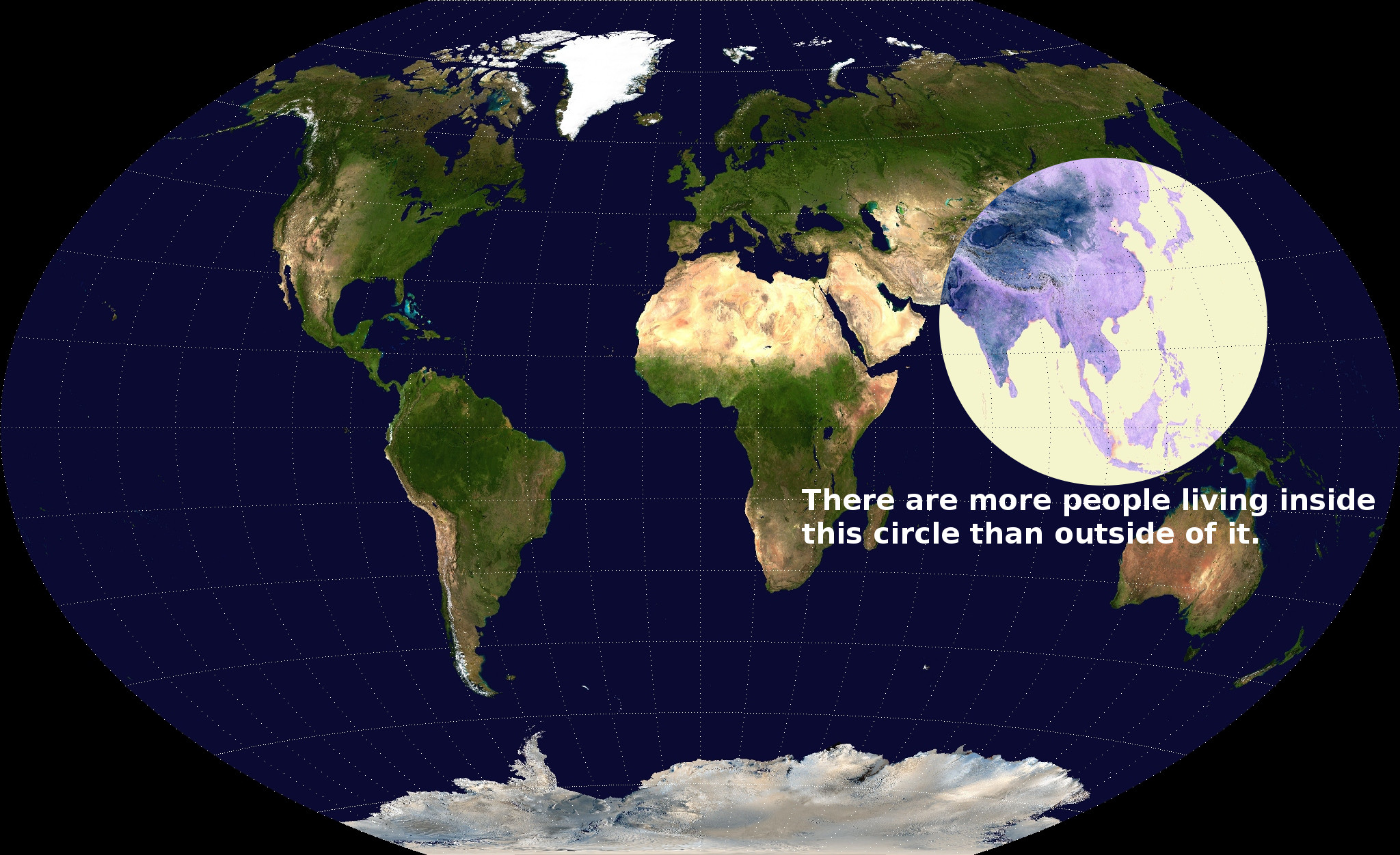
Most people live in this circle
This map serves as a dramatic illustration of how much more densely populated south and east Asia are than the rest of the world. This, in turn, is a legacy of economic systems that existed centuries ago. Rice cultivation, popular in this region of the world, generates many more calories per acre than are yielded by traditional agricultural practices elsewhere. Modern technology means that the world's population no longer has to be distributed according to where rice is cultivated. But the higher population density of the traditional rice-growing areas persists to this day nonetheless. Over time, migration and differential birth rates may level things out.
 World light map
Economic activity is abstract and, in many ways, hard to measure precisely. Something cruder, like this satellite image of the world at night, in some ways does more to visualize it than any number of more official indicators possibly could. What you see is that in rich countries, light is largely a proxy for population density. Observe the thick cluster of the US Northeastern Megalopolis and the even bigger cluster in northwestern Europe. In poorer regions, however, the map represents not just population density but also the actual availability of electrical lighting. Huge swathes of Africa are barely illuminated at night, and densely populated India looks rather dim.

http://www.vox.com/2014/8/26/6063749/38-maps-that-explain-the-global-economy
 = new reply since forum marked as read
