Trump administration reverses font change meant to aid readers with disabilities
Source: Scripps News
Posted 2:59 PM, Dec 10, 2025 and last updated 3:14 PM, Dec 10, 2025
The Trump administration is making changes to official State Department documents, starting with the typeface used in government communications.
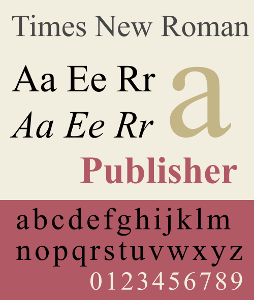
Secretary of State Marco Rubio issued an order Tuesday requiring the State Department to stop using the Calibri font and return to Times New Roman for all official documents.
The move reverses a 2023 decision by the Biden administration to switch to Calibri based on recommendations from internal diversity and disability groups. According to a cable sent to U.S. diplomatic posts reported by The New York Times, the font change is intended to "restore decorum and professionalism to the department's written work."
Calibri is considered more accessible for people with reading difficulties due to its simpler letter shapes and wider spacing between characters. Accessibility advocates had praised the Biden administration's adoption of the font for making government documents easier to read for individuals with dyslexia and other reading challenges.
Read more: https://www.scrippsnews.com/politics/the-president/trump-administration-reverses-font-change-meant-to-aid-readers-with-disabilities
More petty shit.

Here’s a visual comparison between Times New Roman and Calibri, with both fonts set to the same size. Image: Jess Weatherbed / The Verge
(above from here - https://www.theverge.com/news/841664/calibri-is-too-woke-for-the-state-department)
 = new reply since forum marked as read
Highlight:
NoneDon't highlight anything
5 newestHighlight 5 most recent replies
= new reply since forum marked as read
Highlight:
NoneDon't highlight anything
5 newestHighlight 5 most recent replies
The Roux Comes First
(2,317 posts)I don't see it as anything more than finally getting beyond the low-hanging fruit in undoing everything Biden and taunting People Who Need People.
I.e., the luckiest people in the world.

slightlv
(7,933 posts)It's petty, vindictive, and just something else to undo from the Biden Admin, since trump can't do anything to better what Biden did... he'll just undo everything. That'll be great... the comparison will be clear and concise... and Democrats ought to run with it on every banner and message, new media and old.
Also, it allows him to hurt another group of people he'd really just railed against and diminished by words. The "disabled" don't fit into his Gestapo-ruled, Nazi nation.

PJMcK
(25,119 posts)It’s an elegant, professional and readable font. It works in all point sizes and bold/italics, etc.
For a musical font, I prefer Petrucci. It more closely emulates the classical type font from manual typewriters modified for music.

IronLionZion
(51,533 posts)I stopped using Times New Roman long ago. I like Arial or Calibri.

ultralite001
(2,665 posts)Sans Serif (Calibri)...
Fonts come in two broad categories: serif + sans serif.
Serif fonts have small extensions at the end of each stroke, called serifs.
Examples are Times New Roman, Garamond + Cambria.
Sans serif fonts have no serifs.
Examples are Arial, Tahoma + Calibri.

Which Are More Legible: Serif or Sans Serif Typefaces?
Poole's conclusion:
"...it makes much more sense to argue in favour of serif or sans serif typefaces on aesthetic grounds than on the question of legibility."
https://alexpoole.info/blog/which-are-more-legible-serif-or-sans-serif-typefaces/

BumRushDaShow
(172,086 posts)The issue that he misses is sans serif is supposedly easier to process by those with vision disabilities. Similar has been noted about use of certain colors on webpages with text content.
Am guessing that this will all be dissolved soon - Americans with Disabilities Act Accessibility Standards
(I had to have annual training on the ADA and Section 508 of the Rehabilitation Act when I worked for the feds but "laws" are irrelevant nowadays)
ultralite001
(2,665 posts)Back in olden times, readability + consistency were important considering how much the legal field depended
on reading, referencing + reproducing pleadings + citations... Their concern for accessibility by those with
low / no vision was negligible.
Advances in optical scanning, character recognition + speech synthesis are important tools that allow people
who are blind or visually impaired to access printed information. However, access for those w/ vision impairments
is much more complicated than simply changing a font that is recognizable by machine readers -- + Krasnov's minions
have repeatedly shown they are oblivious to consequences of their actions...
Actions by this administration follow a recognizable pattern: Make online information unreadable; make once
accessible online information disappear; ban printed media altogether... + that's just a beginning...
BumRushDaShow
(172,086 posts)by Democratic-led administrations, in order to improve the accessiblity of FEDERAL websites.
The loon GOP doesn't give a damn and as some other sources of this same story note - "accessibility" and "disability" is considered "DEI" and "Woke". 

ultralite001
(2,665 posts)I spent a considerable amount of free time in my younger days adapting equipment + designing
software to be used in "adaptive environments" so low / no vision folks could do remarkable jobs
(often for federal, state + local governments)... so wheelchair bound folks could function impressively
in their workplace... too many instances to mention... but in every instance -- the time spent +
modifications made had far-reaching positive results that were paid forward each + every day...
As you note, "The loon GOP doesn't give a damn"...

70sEraVet
(5,605 posts)THANK YOU FOR YOUR ATTENTION TO THIS MATTER!!!!!!

Prairie Gates
(8,467 posts)Sans serif typefaces are "considered" more accessible (for screen in particular) as a result of 40 years of methodologically rigorous usability testing in industry and academia. It's not an aesthetic judgment.

regnaD kciN
(27,697 posts)BumRushDaShow
(172,086 posts)It might be more limited for mobile devices and their apps.
MLWR
(1,072 posts)
pansypoo53219
(23,159 posts)
Attilatheblond
(9,208 posts)
groundloop
(13,905 posts)
Talitha
(8,148 posts)