Environment & Energy
Related: About this forum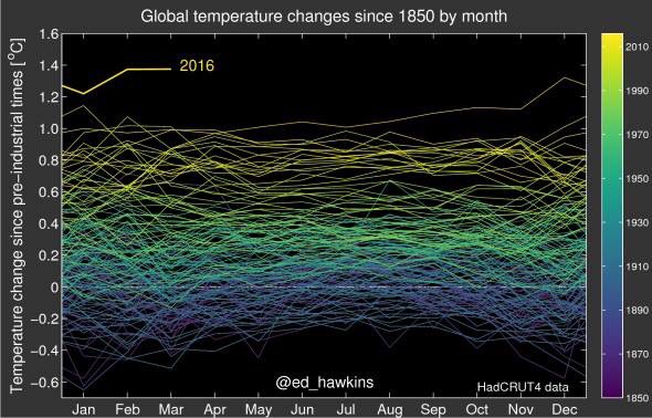
 = new reply since forum marked as read
Highlight:
NoneDon't highlight anything
5 newestHighlight 5 most recent replies
= new reply since forum marked as read
Highlight:
NoneDon't highlight anything
5 newestHighlight 5 most recent replies

Kilgore
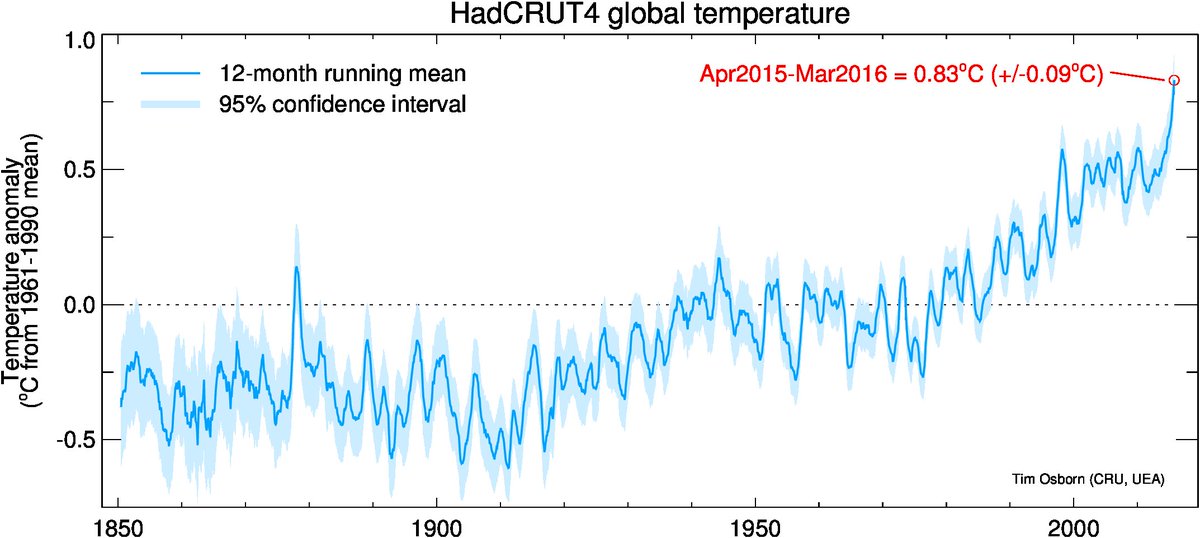
(1,819 posts)Want to see how they account for measurement error. Measurement technique in terms of accuracy, and repeatability have changed since 1850.

LiberalArkie
(19,912 posts)electronic thermometer is the same temp as one from the first reading. Like all the barometric pressure readings are given for the pressure at sea level.
Kilgore
(1,819 posts)Historical data is meaningless unless one understands the methodology to normalize it to a common reference.
scscholar
(2,902 posts)GliderGuider
(21,088 posts)Perhaps you could ask him?
I have no connection to him, but the data is here:
https://crudata.uea.ac.uk/cru/data/temperature/#datdow
Kilgore
(1,819 posts)
GliderGuider
(21,088 posts)Not as punchy as the one above or The Spiral, but still gets the point across.

mackdaddy
(1,991 posts)This years spike in temperature looks like the 1998 el nino spike that the deniers used for the supposed "pause".
With some of the stored ocean heat energy released, the global temperature may drop for a year or two like in previous events. This of course if this happens it will be used by the deniers as the end of global warming, if this occurs.
But I think that it may be possible that we have reached a new phase and we may NOT see a dip or even pause in the global temperature rise. We may have activated enough of the positive feedback loops predicted to just keep going up at unprecedented rates.
Not that we can do much about this now, just interesting to speculate since this graph is pretty much charting the end of civilization as well as global temperature trends.....

Canoe52
(2,963 posts)I finally came to that conclusion myself. What a bitch it is to watch the beginning of the end.