Environment & Energy
Related: About this forumCO2 Emissions from Electrical Generation: 1980 to 2030
The growing debate on electricity generation into the near future, the future roles of wind and nuclear power relative to fossil fuels, and the implications for CO2 emissions in the next couple of decades, got me curious to do a more thorough assessment of world electricity generation.
The purpose of this analysis is to investigate whether or not the adoption of industrial-scale renewable electricity that is now under way around the world is likely to reduce CO2 emissions over the next 20 years. In other words, I wanted to take (yet) another stab at placing renewable energy, especially wind power, in the larger context of electricity generation trends.
Actual Generation
Note: I didn't use "installed capacity" figures in this analysis, because my main interest is in electricity that either has been or may actually be generated. Installed capacity doesn't reflect these values well.
To begin a project like this, one needs numbers for the amount of electricity that has historically been generated by different sources - numbers that are widely accepted as accurate. For this data I went to the EIA. They maintain an easy-to-access database of the TWh that have been generated from different sources from 1980 until 2009 (and in some cases 2010). I used that data to derive the following graph:
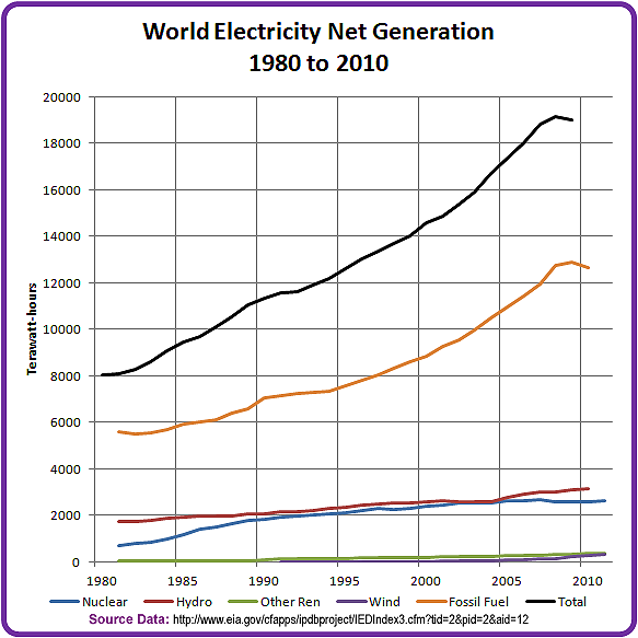
Figure 1. Actual Electrical Generation by Source (EIA)
Projected Generation
Next, I projected each of the sources out to 2030. To do this I applied various Excel trend lines to each source, choosing the trend line that gave the highest correlation coefficient. In the case of most sources the trend lines were second order polynomials.

Figure 2. Projected Electrical Generation by Source
Sanity Check
- For hydro power a linear projection worked well.
- For wind power, I started the trendline in 1990, in order to avoid the unrepresentative situation in the first 6 years of the data. This had the benefit of giving a higher end result in 2030.
- For nuclear power, the shape of the curve suggests that it could steadily lose ground over the next 20 years, falling to quite low levels by 2030. This may be confirmation bias on my part - I expect the use of nuclear power to be gradually phased out as plants age and new builds are cancelled or delayed.
- Wind could overtake nuclear power around the middle of the next decade, and never look back.
Next I needed to do a sanity check on my projections. For this I went to the IEA's WEO2008 publication which is a decade newer than the 1998 data used in previous posts on this topic. Here is their reference scenario projection to 2030:

Figure 3. Chart from WEO2008, page 143
Comparison of Actual Data
The EIA data for fossil fuel generation in 2009 is about 12,700 TWh.
The WEO2008 number is about 13,000 TWh.
The EIA data for all renewables in 2009 is 3,750 TWh, and for 2006 is 3,420 TWh.
WEO gives about 3,300 TWh in 2006.
The EIA and WEO numbers for actual generation are in fairly close agreement.
Comparison of Estimated Data
WEO2008 estimates that all renewables will generate over 7,700 TWh in 2030.
My projection for 2030 is 9,300 TWh. The difference is that I project 4,000 TWh of wind elctricity in 2030, compared to the WEO2008 estimate of under 2,000 TWh. My trending technique gives much more hope for the future of wind power than the IEA estimate does.
The WEO2008 estimate for fossil fuels is about 22,000 TWh.
My projection for fossil fuels is 24,000 TWh, about 9% higher than the WEO estimate.
Generation and Source Mix Over Time
The next two graphs give a decadal look at the changes in both the electricity generated by each source, and the proportion of electricity it supplies.
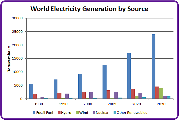
Figure 4. Projected Electrical Generation over Time

Figure 5. Projected Electrical Generating Mix over Time
This graphs clearly show wind replacing nuclear power as a significant generation source between 2020 and 2030.
Unfortunately, as wind and nuclear power trade off against each other, fossil fuels retain their 70% share of the constantly growing energy landscape.
Carbon Dioxide Emissions
As you would expect, under this scenario the amount of CO2 we generate will continue to grow into the foreseeable future.
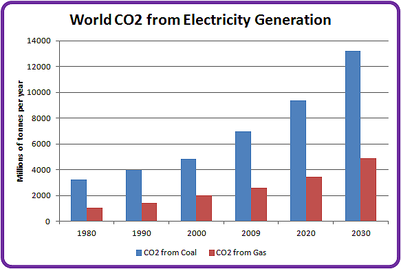
Figure 6. CO2 emissions from Thermal Electrical Generation
The assumptions I made for the CO2 projections in 2020 and 2030 include:
- A constant ratio of coal to gas generation. As is the case today, 55% of the electricity comes from coal and 45% from NG.
- Coal emits around 1 kg CO2/KWh; natural gas emits around .45 kg CO2/KWh. These numbers are within the range of various published measurements for life cycle CO2 emissions from coal and gas plants of various designs and vintages. The 2:1 spread implies that a large-scale global shift from coal to gas could help reduce emissions to some degree (while acknowledging the damage done by fracking...)
The main thing that jumped out at me is that the increasing use of wind power is unlikely to have any impact at all on CO2 emissions until after 2030 - and possibly not for another decade after that. This is because as we are increasing our wind power we are simultaneously dropping another low-GHG source (nuclear power, and good riddance to it!). In addition, the rising demand for electricity will outstrip our ability to build and install wind power over at least the next couple of decades, as shown by the diverging slopes of the fossil fuel and wind trend lines in Figure 2.
Conclusions
- If we stay on our current course without any radical deviations, renewable energy is unlikely to reduce the CO2 emitted by the world's electrical generation activities. If it does so, it will take a long time (30-50 years?) to make a significant difference. If we believe the current predictions of global warming, such a scenario is an ironclad guarantee of a +6 degree future.
- The only sure way to reduce CO2 emissions is to drastically reduce our fossil fuel consumption - not to squeeze it out of the market incrementally by replacing it with lower-cost wind, but to radically reduce the energy we get from that source. Unfortunately, unless something radical happens to the global economy, such a shift (say a drop to 50% of current levels in 20 years) is unlikely.
- This analysis doesn't take transportation issues into account. Over 70% of our oil is used in that sector.
- Only about 25% of our total CO2 emissions come from the electricity sector. Any improvements we make in this one sector are going to have marginal impact if other sectors (especially transportation and land use) are left unaddressed.
References:
EIA - Data: http://www.eia.gov/cfapps/ipdbproject/IEDIndex3.cfm?tid=2&pid=2&aid=12
IEA - WEO 2008: http://www.iea.org/textbase/nppdf/free/2008/weo2008.pdf
IEA - CO2 Emissions from Fuel Combustion, Highlights 2011: http://www.iea.org/co2highlights/co2highlights.pdf
 = new reply since forum marked as read
Highlight:
NoneDon't highlight anything
5 newestHighlight 5 most recent replies
= new reply since forum marked as read
Highlight:
NoneDon't highlight anything
5 newestHighlight 5 most recent replies

kristopher
(29,798 posts)And what years were they?
ETA: Where the last discussion left off showing the trendline you had deliberately tried to obscure.
http://www.democraticunderground.com/?com=view_post&forum=1127&pid=15913
EIA and IEA long projections are not valid - we established that damned well in that thread with the 1998 WEO projection.

Why isn't solar hot water included?

GliderGuider
(21,088 posts)I didn't use any EIA projections, just their record of actual production.
I used the WEO (2008, not 1998) projections as a sanity check - they were not included in the data set. Feel free to provide more authoritative 2030 estimates of global generation for comparison.
I didn't include solar hot water, because I was looking at electricity - I stuck with the published figures on electricity generation. SHW spares some electricity, but I wouldn't expect the effect to make a difference in the global industrial picture.
The renewable numbers I got from the EIA for 2009 are identical to the ones shown in your chart: a total for all renewables excluding hydro of 615 TWh, and a total for wind of 262.5 TWh.
kristopher
(29,798 posts)I know you used 2008 IEA projections but that is hardly a "sanity check" since we've already established, by using their 1998 projections, that they are not an accurate source of information regarding renewables. In fact, the problem is so pronounced that a new agency has recently been created to deal specifically with the renewable energy on the same terms that IEA deals with fossil and nuclear = International Renewable Energy Agency (IRENA).
Oh, on the "authoritative estimates" - you can download the IPCC review and find 160 of them.
http://www.democraticunderground.com/112715489
You are an extreme outlier.
GliderGuider
(21,088 posts)I refer you to the SRREN document you mentioned in the post you linked to. In the Technical Summary at http://srren.ipcc-wg3.de/report/IPCC_SRREN_TS.pdf on page 135 you will find Figure TS.10.4. The first panel of that figure shows the scenario ranges for the various technologies. My projection shows wind generating 4,000 TWh in 2030. That's 14.4 Ej. The IPCC figure shows that to be right smack in the middle of the coloured bar - the inter-quartile range (25% to 75%) for wind.
The same thing is visible even more clearly in the wind panel of figure TS.10.5 on page 136. My projection falls neatly into the high-probability range, for all three CO2 scenarios.
I think my numbers are just fine, and you simply don't like my methodology or conclusions.
kristopher
(29,798 posts)You've largely addressed my criticisms from the earlier discussion and you do, in fact, appear to be in line with median values in the studies the IPCC reviewed. You are to be commended for the work and the good faith you brought to the effort tonight.
Two thoughts for your consideration. Like most studies of this kind the raw data tends to be a bit stale. The latest numbers they post in their description of our current status are for 2008 and I'm inclined to think none of the underlying studies are more recent than 2009 meaning they are not capturing the full impact of China's policies.
I also think the distribution of the projections on pg 136 is interesting, don't you think? The median is extremely close to the low end of the range with distribution above median accounting for a significant portion of the entire range of estimates.
Simply put the more conservative projections are clustered together while the optimistic projections tend to be more spread out.
What do you believe accounts for the difference in distribution? What assumptions are at play here?
GliderGuider
(21,088 posts)It's a Project Management technique for estimating the most likely schedule for a project or task.
- The most pessimistic (P) case when everything goes wrong
- The most optimistic (O) case where everything goes right
- The most likely (M) case given normal problems and opportunities
There are a lot of political, financial, logistical or technical assumptions that could sway an outcome in either direction. If I was an expert on what they are I'd be in the business.
kristopher
(29,798 posts)... I thought you'd enjoy some Memorial weekend sunshine.
Where does your work fit?

[font size="1"]Low stabilization and new long term scenarios from the IPCC Special Report on Renewable Energy Sources and Climate Change Mitigation (SRREN)
UN Climate Change Conference Bonn, Germany, 19 May 2012 Jan Minx, Head of Technical Support Unit, IPCC Working Group III
Slide 2[/font]
Does this suggest to you where differences in projections might occur?

TS pg 41
And a motivator (as if you might need one)

[font size="1"]Low stabilization and new long term scenarios from the IPCC Special Report on Renewable Energy Sources and Climate Change Mitigation (SRREN)
UN Climate Change Conference Bonn, Germany, 19 May 2012 Jan Minx, Head of Technical Support Unit, IPCC Working Group III
Slide 4[/font]

XemaSab
(60,212 posts)that you so decry?
"Having close knowledge of the pattern of very poor projections by the EIA and the IEA regarding renewables."
Is that your definition of "decry"?
I think they are largely good sources for current data if you read the fine print. I think they are geared far more to work with patterns presented by fossil fuel and nuclear resources since that is what their focus has been since their inception.
Do you have evidence that they're especially good at renewable projections? If so, I'd be interested in seeing it.

intaglio
(8,170 posts)One is the lead time of bringing nuclear capacity online. Plant does not just spring into existence - especially nuclear plant - and certainly in Europe the lead time is of the order of 20 years. The following timescales are UK based.
Begin at the beginning.
A site has to be found, no-body in Europe actually wants any power station built anywhere near them and virtually everywhere in Europe is in someone's backyard. At that point surveys have to be undertaken and the first detailed plans have to be drawn up before it can even be submitted to "Outline planning approval". Remember that the builders will not want to submit more resources than absolutely necessary so the cost of more detailed study is held back. Even at the stage of "Outline planning approval" plant will be opposed and such initial objections can take years to overcome. Being generous to you it would take about 2 years and more likely 5 years due to inevitable legal challenges.
Time so far - 2 years
Next for the site comes the formal and detailed evidence gathering on environment, geology, archaeology and regional impact, not just for the plant itself but for all the ancillaries such as permanent and temporary access. During this the plans will have to be amended to allow for the new information and other plans regarding the infrastructure prepared - another 2 years at least - and that is even before submitting to the formal planning enquiry.
Total time - 4 years
At that enquiry objectors to the plan (and for a nuclear station there will be many) have to have the chance to present their own studies and rubbish the studies of the builders. Even during this there will be objection and legal challenges. If you don't believe me here are a couple of examples:
1) The planning process for the A303 improvement plan at Stonehenge; from 1991 to the eventual cancellation of the proposal in 2007 not one spadeful of dirt was moved yet every body agrees that such a project is needed.
2) Similarly the Sizewell B station was first proposed in 1969, plans were changed seveal times before the beginning of the formal enquiry in 1981. Despite the fact that the site was a designated nuclear island, thus short circuiting many objections to a "greenfield" site, that enquiry took 6 years until permission granted which was, even then, conditional on an adequate safety case being prepared
Given the challenges that EU nationals, EU nations and non-EU nations are likely to make, then 10 years is a very short time to allow for this process.
So let's total the time, 14 years or 2026
Assuming everything goes right for the builders under current conditions, then there is the construction time to consider. Check Sizewell B again. It was constructed in the standard SNUPPS blueprint because a novel design would add horrendously to the planning and safety approval process (as well as possibly not performing to specification) construction took place between 1987 and 1995. 8 years. But what if several countries have decided on this design to fulfill your blueprint? There are very few manufacturers that can produce pressure vessels and producing more than 1 or 2 at a time is pushing the production facilities to the limit. The result will be either an overlong production process for PVs or a big overcharge to get you first in the queue, Ignoring this let's add in the Sizewell B construction an commissioning time to our total.
Total time, 22 years or 2034
This is considerably beyond the projection date you used to justify the construction of new nuclear plant.
Now I will admit that the British government has produced studies that envision several new nuclear power stations with both Hinckley Point and Sizewell on the list and (possibly slightly optimistically) projected that such stations could be in use by the "early 2020's. These plans have not even gone to the Nuclear Installations inspectorate yet because they are to be to a novel (for the UK) Ariva EPR design. As yet these plans still have not had initial approval.
Finally let us look at the operational history of Sizewell B.
Commissioned 1995; planned operational life 40 years with standard maintenance shutdowns every 18 months.
First multi-day unplanned shutdown 27 May 2008, not nuclear in origin, but still.
May 2010 1 month shutdown due to excess moisture.
I think you too may be being a trifle overoptimistic about the potential of nuclear plant.
GliderGuider
(21,088 posts)Not a chance! I'm perfectly happy to see the curve of nuclear generation sliding down toward 2030. I do not want to seen any new nukes built, and I want to see the operating ones shut down as quickly as is politically possible.
Nuclear power is completely the wrong sort of technology to be building this close to the end of a cycle of civilization. It's too expensive, it's dynamically unstable (meaning it takes constant attention to keep various things from going wrong with it), and the consequences of an "excursion" are too great for a stressed, decaying civilization to deal with adequately.
If we're going to run around spending money and effort to keep the lights on, better to spend it on lower-tech projects with fewer consequences if part of it breaks down. I'd rather have a dozen busted, flaming windmills in the next field than a single busted, flaming nuke.
My big concern is CO2, since its consequences may be fatal for entire ecosystems far into the future. Not adding nuclear concerns on top of that, for marginal return, seems only sensible.
intaglio
(8,170 posts)I did realise my mistake but unfortunately in the edit I forgot to remove stuff that might have seemed critical or change the tone of the post. Sorry I got that wrong.
On first reading I realised that you had left out arguments against nuclear. I saw a need to include the data about the delays and costs of building "radioactive tea kettles". I concentrated on the delays, because the UK is good for documenting that sort of stuff, and hoped you or someone else would post about excess and unrecognised subsidies or the possibilities for energy reduction in other areas or other generating options which must be developed.
TBH I find certain people in this forum entirely too forgiving of the nuclear option and so I can post longish screeds because it is vastly important that the nuclear plant are not built. I understand the attraction of nuclear for 18 months ago (or less) I would have been on the side of the devils but I had been wavering for a couple of years. Nuclear is the easy option, an existing technology that industry supports and that would fit into current infrastructure but the level of risk over the lifetimes of these dinosaurs is too high.

joshcryer
(62,536 posts)
Cheap renewable energy is going to bring it up from the 20% it is around now to much higher.
GliderGuider
(21,088 posts)All the sectors in which we're not addressing the problem, in one neat pie chart...
joshcryer
(62,536 posts)I did find a breakdown, actually, but it's on a denier site, and I couldn't find their source (typically). I'll have to try again because this is really important, I think. US Coal production is going up despite that coal consumption is going down. Why? We're exporting it!
kristopher
(29,798 posts)joshcryer
(62,536 posts)US industry has largely plateaued.
kristopher
(29,798 posts)Among others you'll find the IPCC.
joshcryer
(62,536 posts)These are scenarios, though, not actual numbers as far as I can tell. Still, it's instructive. Industry produces up as much as twice as much as power in some scenarios (A1T 2050 scenario, Africa). Oh the tangled web...
kristopher
(29,798 posts)If you haven't looked over the first EPA document you might find it gives you a good framework for conceptualizing the problem. It is a very comprehensive report, and I only gave you the link to the ExSum.
joshcryer
(62,536 posts)...it wasn't what I was looking for.
They are instructive enough to separate out electricity generation, which PV and Wind and other renewable sources excel at. They consider "industry," as far as I can tell, the combined effects of refining of fuel (not the end use combustion of petrol such as cars, since these are stationary sources that, as the paper discusses later on, are useful for sequestration), the smelting of metals, the production of cement, and the production of petrochemicals (not fuels but things like plastics). When combined together they comprise 'industry.'