Health
Related: About this forumCovid data links, revised 12/12/22
Last edited Mon Dec 12, 2022, 02:01 PM - Edit history (11)
ABBREVIATIONS:7dma - 7 day moving average
Quick Links
Updates to this thread (e.g. new links and topics added) https://www.democraticunderground.com/114224534#post1
CDC's Community Levels map (Green, yellow, orange) U.S. map showing all counties
https://covid.cdc.gov/covid-data-tracker/#county-view?list_select_state=all_states&list_select_county=all_counties&data-type=CommunityLevels
CDC's Covid Data Tracker Weekly Review
https://www.cdc.gov/coronavirus/2019-ncov/covid-data/covidview/index.html
New York Times: U.S. States: https://www.nytimes.com/interactive/2020/us/coronavirus-us-cases.html
. . . Countries of the World: https://www.nytimes.com/interactive/2020/world/coronavirus-maps.html
OurWorldInData.org - Super Site for countries of the world, but doesn't have U.S. states https://ourworldindata.org/coronavirus
Covid Tracking Project: https://covidtracking.com/data
Worldometers: Countries of the world: For country population sizes and the covid situation in each country and the world overall
https://www.worldometers.info/coronavirus/
Worldometers: For U.S. states (and the U.S. overall)
https://www.worldometers.info/coronavirus/country/us
Positivity rates and testing rates and other metrics
https://coronavirus.jhu.edu/testing/tracker/overview
https://covidactnow.org/?s=1301312
https://coronavirus.jhu.edu/testing/individual-states
https://covidtracking.com/data
https://coronavirus.jhu.edu/testing/tracker/map/new-tests-per-100-k-people
Detailed page on positivity and test rates, describing the above pages, post#2 in this thread
The U.S. overall positivity rate, 7dma:
OurWorldInData.org - https://ourworldindata.org/coronavirus
https://coronavirus.jhu.edu/testing/individual-states
(one has to read it from the graph or hover the mouse just right)
U.S. overall testing rate:
OurWorldInData.org -- https://ourworldindata.org/coronavirus
https://covidtracking.com/data
(Some math required, see details in the "U.S. overall testing rate" section below.
Excess mortality - https://ourworldindata.org/excess-mortality-covid
Vaccination rates:
NPR: By state: has (#1#) fully vaccinated, and also (#2#) at least one dose by state: https://www.npr.org/sections/health-shots/2021/01/28/960901166/how-is-the-covid-19-vaccination-campaign-going-in-your-state
New York Times vaccination rates (no paywall, maps and tables galore)
https://www.nytimes.com/interactive/2020/us/covid-19-vaccine-doses.html
BeckersHospitalReview: By state: Number fully vaccinated, population, and percentage fully vaccinated
https://www.beckershospitalreview.com/public-health/states-ranked-by-percentage-of-population-vaccinated-march-15.html
There are a number of other sites that have added vaccination rates -- search below on "vaccin"
RESTRICTIONS, Shutdowns, lockdowns -- see section way below
Alternatives to New York Times
## CovidActNow: https://covidactnow.org/?s=1124253 -- the states are numbered in the listing so don't have to count them like the NYTimes
## Global Epidemics: https://globalepidemics.org/key-metrics-for-covid-suppression/ -- also numbers the states
## Reuters: https://graphics.reuters.com/HEALTH-CORONAVIRUS/USA-TRENDS/dgkvlgkrkpb/index.html -- it has mini-charts of all 50 states all on this page, but are not as much resolution as the New York Times ones
## John Hopkins 50 states' minicharts "map" page, alternative to the NY Times from John Hopkins University
The below "map" of the 50 states' minicharts (which are scaled by daily new cases PER CAPITA), is from the John Hopkins U.https://coronavirus.jhu.edu/data/new-cases-50-states
Purpose: Just to gather together some useful links in one place to check out the Covid situation in a state or country.
Particularly for a U.S. state, it is helpful to know more than just the number of cases (or hospitalizations or deaths), because for example, is 5,000 new cases for a particular state a terrible number or not compared to other states or the U.S. average?.
Helpful context to have so that it can fairly be compared to one's state, to other states and to the U.S. average :
Per Capita -- Often large states are bashed for having high case numbers. Fine. But it helps to provide what its per-capita numbers are and how it compares in that regard to the U.S. average and to other states, e.g. is it 15th best or 12th worst or about median or what.
7 day moving average (7dma). One day data is only marginally useful information. Testing and reported case results vary greatly by day of the week and also just day-to-day statistical volatility. This day-of-the-week effect and volatility varies from state to state. And sometimes days are reported that are actually a combination of 2 or more days and are presented as one day results - very misleading.
7 day moving averages get rid of the day-of-the-week problem. Every 7dma is an average of all 7 weekdays.
As an example of the day-of-the week effect, here is an example from Minnesota, written December 8 by Minnesota Public Radio's David Montgomery:
"Mondays are typically the days when the most people go get tested. And data from Mondays tends to show up on Thursdays and Fridays — since the beginning of September, on average about 10 percent of eventual cases are reported on Wednesday, 35 percent on Thursday, 23 percent on Friday, 13 percent on Saturday, and 16 percent on Sunday." ((Hmm, that totals 97%, meaning that only 3% are reported on Monday and Tuesday combined -Progree))
Daily new cases (as opposed to cumulative total since the pandemic began) -- Daily new cases (best: per capita and 7dma) tell us where the hotspots are NOW, not the states that had a rough spring or summer. (When I do want to look at cumulative totals since the beginning, I choose Worldometers for that (below) )
Trends - Are new cases increasing or decreasing, and how rapidly? I usually look at the mini-charts at the top of the New York Times page, and then click on a state for a detailed look and larger graphs, for example
U.S. with mini-charts for each state, all on one page:
https://www.nytimes.com/interactive/2020/us/coronavirus-us-cases.html
California as an example: https://www.nytimes.com/interactive/2020/us/california-coronavirus-cases.html
In a posting, realizing that fewer than 10% of the people click a link, I often present a mini-summary, e.g. this from a January 3 posting of Nevada:Daily new cases, 7 day moving average
https://www.nytimes.com/interactive/2020/us/nevada-coronavirus-cases.html
1173 July 20 -- the pandemic high point until early November
277 Sept 13 -- post summer peak low point
2727 Dec 9 -- pandemic peak
1896 January 2 - latest (down 30% from the peak).
This page currently focuses on cases, especially daily new cases per capita, 7dma in these links, because they are the leading indicator. Hospitalization rates and death rates tend to follow weeks after.
However, daily cases per capita in the data we see are reported cases. That in turn depends on the testing rate. Some states have relatively low testing rates and therefore, in general, relatively low reported case rates compared to those that do more testing. There is a special section below " Testing Rates (e.g. tests per day per capita), Positivity Rates" with that information.
Hospitalization rates, especially new admissions rates if available, are the next metric in the timeline that confirm that the situation is improving or worsening, and not just because of a change in testing rates. That and the trend in test positivity rates
DETAILS
New York Times
What's bad is that some people don't have access to the New York Times -- however do note that their coronavirus coverage is free and unlimited, but one has to sign up for that (they might have gotten rid of that requirement). In the many months I've used it, I've never been asked to sign in again.
. . . U.S. States:
https://www.nytimes.com/interactive/2020/us/coronavirus-us-cases.html
I love it for its mini-charts of all 50 states (they are by default drawn to the same scale per capita so that states can be compared). As well as the table where one can rank the states by NEW per capita cases, 7 day moving average.
Warning that testing rates affect the reported case rates, so states that test more may have worse looking case rates than states that test less, and so comparisons aren't fair.
. . . Countries of the World:
https://www.nytimes.com/interactive/2020/world/coronavirus-maps.html
Same comments as for U.S. States.
===############################################===
OurWorldInData.org - Super Site for countries of the world, but doesn't have U.S. states https://ourworldindata.org/coronavirus
This has positivity and also test rates -- for Positivity, choose the "Share of Positive Tests" radio button above the graph. For testing rates, choose the "Tests" radio button above the graph then 7-day rolling average and "Per 1,000 people" checkbox. Has views: Chart, Table, Map. Also can Download. Yes, the Tests per 1000 people 7dma in the chart match the table (the table show the latest day's info (7dma if that's what was selected) )
https://ourworldindata.org/coronavirus
## Excess mortality - https://ourworldindata.org/excess-mortality-covid
## Missing: U.S. states. It's "just" countries of the world.
===############################################===
Covid Tracking Project
CovidTracking: https://covidtracking.com/data
Good for U.S. overall statistics: Daily Tests, Daily Cases, Currently Hospitalized, Daily Deaths -- both for the most recent day, and the 7 day moving average. And Cumulative totals for all of the above (except hospitalization). All with graphs
Then followed by the above for each state. Some (most) have race & ethnicity statistics, long-term care facilities, viral (PCR) tests and antibody tests.
Unfortunately no graphs for the states.
But click on "Historical Data" links to see the daily numbers going all the way back.
===############################################===
Worldometers:
For country population sizes and the covid situation in each country and the world overall (with al the caveats below):
https://www.worldometers.info/coronavirus/
For U.S. states (and the U.S. overall)
https://www.worldometers.info/coronavirus/country/us
Vitally Important: the default "Now" button likely has incomplete and too small New Cases and New Deaths data. Better to click the "Yesterday" button or the "2 days ago" button to make sure to get complete case data for a day.
A sucky thing about Worldometers is that they don't have anything for new cases per 1M population or new deaths per 1M population. After clicking the "Yesterday" or "2 days ago" button as cautioned above, one has to do the math by dividing the New Cases (or New Deaths) by the population. And there's no way to sort the table by new cases per 1M population or new deaths per 1M population because these columns don't exist.
All of the per-capita stuff (Total cases/1M pop, Deaths/1M pop, Tests/1M pop) are cumulative totals since the pandemic began. To me, most of that is ancient history, and I usually care much more about what's been happening the last few days or weeks. But like I said above, New Cases and New Deaths are not given on a per capita basis).
Another caution about New Cases and New Deaths is (besides remembering to click the "Yesterday" or "2 days ago button" so as to get a full day rather than a partial day of information), is that the daily amounts fluctuate quite a lot from day to day with some high days being the result of unusual case backlogs being reported on one day, for example. I much prefer sites that present 7 day moving average so as to smooth out the day-to-day volatility, and to also capture an entire week so as not to get biased data for days of the week where there is usually low or high numbers such as weekends and Mondays etc.
Good things about Worldometers:
. . . Shows the populations
. . . Shows the U.S. overall on the listing of the U.S. states, and the world overall on the listing of countries. A lot of other resources don't do that simple common-sense thing, so that, for example to compare the infection rate of Illinois to the U.S. overall, one has to visit 2 pages, and sometimes can be hard to find.
===############################################===
Testing Rates (e.g. tests per day per capita), Positivity Rates, and other useful web pages with this information
https://www.democraticunderground.com/114224534#post2
===############################################===
Excess mortality - https://ourworldindata.org/excess-mortality-covid
===############################################===
RESTRICTIONS, Shutdowns, lockdowns:
New York Times, all states
. . . https://www.nytimes.com/interactive/2020/us/states-reopen-map-coronavirus.html
Midwest: Coronavirus-Related Restrictions By State, NPR, 12/3/20
. . . https://www.npr.org/2020/06/11/847413697/midwest-coronavirus-related-restrictions-by-state
NPR all states:
. . . https://www.npr.org/series/847328455/coronavirus-restrictions-in-each-state
===############################################===
Alternatives to New York Times
## CovidActNow: https://covidactnow.org/?s=1124253 -- the states are numbered in the listing so don't have to count them like the NYTimes
## Global Epidemics: https://globalepidemics.org/key-metrics-for-covid-suppression/ -- also numbers the states
## Reuters: https://graphics.reuters.com/HEALTH-CORONAVIRUS/USA-TRENDS/dgkvlgkrkpb/index.html -- it has mini-charts of all 50 states all on this page, but are not as much resolution as the New York Times ones
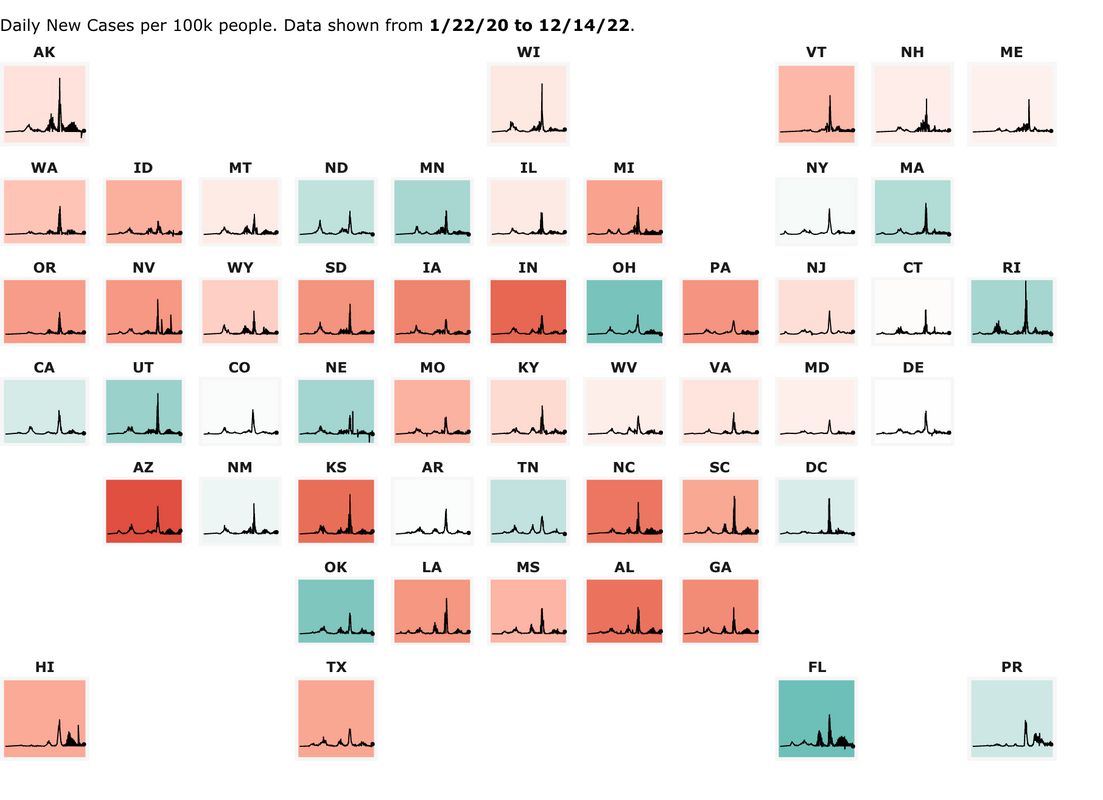
## John Hopkins 50 states' minicharts "map" page, alternative to the NY Times from John Hopkins University
The below "map" of the 50 states' minicharts (which are scaled by daily new cases PER CAPITA), is from the John Hopkins U.
https://coronavirus.jhu.edu/data/new-cases-50-states
-- at that page you can click on individual states on the "map". Showing 3-day moving average of new cases. I prefer the nytimes' charts which are 7 day moving averages). But I'm not sure how up to date the below .jpg image file is, so its better to click the ABOVE link (also the individual states on the above link are click-able to show more info on the states)
Tips
Tired of trying to move the mouse to the exact right position on a graph to read the data point box that pops up? e.g. to get the mouse on the peak point of the graph, or to get it on the last point on the graph --- Turn Mouse Keys on: On Windows 10, hit the Window Key, and type in Mouse Keys, and it will take you to the Settings to turn it on or off.
Also, very importantly, UNcheck the checkbox "Only use Mouse Keys when Num Lock is On"
Then when you want to use Mouse Keys, have NUM LOCK OFF, and use the cursor arrows on your numeric keypad to move the mouse cursor.
When you want to use the numeric keypad to type numbers, turn NUM LOCK ON.
Also I sometimes zoom in on a graph (Control + to zoom in, Control - to zoom out, Control 0 to reset to 100% zoom) in order to position the cursor just right, but that's been getting more and more difficult even when zoomed to the max, so I was glad to find that mouse keys work. Wish to heck they'd just link to their data table
 = new reply since forum marked as read
Highlight:
NoneDon't highlight anything
5 newestHighlight 5 most recent replies
= new reply since forum marked as read
Highlight:
NoneDon't highlight anything
5 newestHighlight 5 most recent replies

progree
(13,110 posts)Last edited Mon Dec 12, 2022, 02:03 PM - Edit history (11)
1/10/21 -
# Added this Updates post
# Added OurWorldInData.org - Super Site for countries of the world, but doesn't have U.S. states https://ourworldindata.org/coronavirus
# Added Excess mortality from ourworldindata.org - https://ourworldindata.org/excess-mortality-covid
1/15/21 -
# From the Quick Links in the OP, added a link to the Positivity and Test Rates page (post #2)
# On the OP, Added a tip on using mouse keys to position the mouse cursor to the exact right point
3/31/21-
# On the OP, I improved the Mouse Keys writeup to suggest setting is so that mouse keys is ON when NUMLOCK is OFF.
# To the Testing Rates and Test Positivity page, I added more information to the https://coronavirus.jhu.edu/testing/tracker/overview , https://covidactnow.org/?s=1301312 , and https://coronavirus.jhu.edu/testing/individual-states pages.
4/10/21-
# Added vaccination rates to the OP's Quick Links
6/29/21-
# Added New York Times vaccination rates to the OP's Vaccination section in Quick Links
12/12/22-
# Added a couple CDC links, including one to the wonderful community levels map (green, yellow, orange,)
progree
(13,110 posts)Last edited Wed Mar 31, 2021, 03:42 AM - Edit history (3)
Yes, some states test more than others, and differ in positivity rates too. Thus ranking states by their reported cases (per capita or not) is unfair. Such a list like the above that lists states according to their daily new cases per capita is just a starting point. It is what it is. If there is a website that tries to adjust a list like the above for these factors, please let me know.
About testing rates - Early in the pandemic, there was a great shortage of testing facilities. In some places like Minnesota, they have become abundant, and so testing rates is as much or more a "demand side" issue as a "supply side" issue.
After soaring new cases and testing rates, our governor (Minnesota) completely shut down bars and restaurants for indoor dining in mid-November. Within a few days, daily case levels dropped and then so did testing rates. Testing facilities keep getting added, but with fewer people getting infected, the testing rate also dropped. Most people don't get tested unless they feel some need to do so -- such as feeling symptoms or having been in close contact with a Covid-positive person.
(The declining number of cases in Minnesota was corroborated with rapidly dropping test positivity rates and soon afterwards by dropping hospitalization rates, and after 4 or so weeks, dropping death rates).
So I don't make an enormous hoo hah about a state's low testing rate (compared to other states or the U.S. average) if the test positivity rate is low as well. But a low testing rate combined with a high positivity rate is a big red flag. An even bigger red flag is if the foregoing is true, and additionally, new cases are going up.
Positivity rates and testing rates are compared here:
. . https://coronavirus.jhu.edu/testing/tracker/overview ::
If the page doesn't show all 3 columns ( New Cases, Tests per 100k people, and Percent Positive ), then try lowering your zoom level or widen the window. All 3 of the above statistics are 7 day moving averages, good.
Missing: New Cases PER CAPITA, GRRR (it does have the raw count of new cases). Also missing: the U.S. overall test positivity rate and the testing rate. Duh. Would be nice to have these, especially for comparing specific states to it. Another shortcoming: It also doesn't number the states when it gives a list of states sorted by some statistic, sigh. Also, there are no trend mini-charts, but it does indicate if a state is trending up or down in some statistic over the past week, and separately, over the previous week
. . https://covidactnow.org/?s=1301312 ::
This also has test positivity and also daily new cases per capita, both 7dma, so it's more useful for state ranking in daily new cases than NYTimes, since it has everything I want in such a listing except that it doesn't have testing rates. It also has Population, Infection Rate, ICU Capacity Used (%), and Tracers Hired (%). It is also good that the states are numbered when states are sorted by some metric or another.
In the second half of the page, there are graphs of Cases, Deaths, Hospitalizations, and ICU Hospitalizations all in 7 day moving average. And one can select per 100K and compare 2 or more states.
(BUT the NY Times has those mini-charts of each state's daily case trends all on one page)
Missing: Testing rates. Also missing the U.S. overall test positivity rate. Duh.
. . https://coronavirus.jhu.edu/testing/individual-states ::
U.S. Test Positivity Rate (just a graph) - If one chooses "US" in the pull down dark blue box near the top left, it shows a daily graph of the test positivity rate, 7 day moving average. (It also shows the number of daily tests in millions, and the number of daily positive tests in millions -- the latter is and hopefully remains a small fraction of a million). Unfortunately, for the test positivity rate, one must either read the graph, or hover your mouse over it -- in which case it will pop up the testing rate, as well as the number of tests and the number of positive tests.
Problem is positioning your mouse exactly on the day you want, usually the last day. For that, it comes down to manual dexterity Or using Mouse Keys, which is explained in the OP, and which I prefer. You can also zoom in with your browser's zoom feature.
(no reason they can't just show the last day's 7dma numbers to the right of the graph, sigh).
By the way, it is apparent from the graph that the daily tests fluctuate a lot from day to day. This is one reason I hate Worldometers and other sites that just present the most recent day or one day results. I very strongly prefer those that present the 7 day moving average as that eliminates the day-of-the-week effect, and more generally averages out the day-to-day volatility.
Note also that when the mouse is on the graph, a set of icons appears above the graph for things like zoom, pan, select, and many more. I find them very difficult to use. One that may be useful is "download as .png"
Lastly, note that one can show individual states by selecting them from the pull down dark blue box near the top left.
Missing: U.S. testing rate. But at least it has the U.S. positivity rate, though one has to read it from the graph or hover the mouse just right. ALSO, very annoyingly, on the graph, in the pop up, the date is missing, except for the very last (right-most) data point.
. . https://covidtracking.com/data ::
This has U.S. daily tests, daily cases, currently hospitalized, and daily deaths, all for the latest day and 7dma as well. And all as graphs. The U.S. overall daily tests, 7dma is above the first graph "7-Day Avg". See "The U.S. overall positivity rate and testing rate" section below for how to calculate the testing rate per thousand, per 100k, and per 1 million.
. . . . . Scroll down to see results for states (note the "Jump to a state" purple box with links to the right of Alabama, so you don't have to scroll and scroll)
. . https://coronavirus.jhu.edu/testing/tracker/map/new-tests-per-100-k-people ::
A color-coded map of Daily Testing rates per 100k people, 7dma (hover mouse over a state on the map to see the number for that state).
Missing: U.S. overall, duh
The U.S. overall positivity rate and testing rate :
. . U.S. overall test positivity rate (the percent of tests that are positive), 7dma:
OurWorldInData.org -- https://ourworldindata.org/coronavirus -- choose the "Share of positive tests" radio button above the graph. Has views: Chart, Table, Map.
https://coronavirus.jhu.edu/testing/individual-states where one has to read it from the graph or hover the mouse just right.
https://covidtracking.com/data
(Some math required, see details in the "U.S. overall testing rate" section below.
. . U.S. overall testing rate:
OurWorldInData.org -- https://ourworldindata.org/coronavirus -- choose the "Tests" radio button above the graph, then 7-day rolling average and "Per 1,000 people" checkbox. Has views: Chart, Table, Map. Also can Download. Yes, the Tests per 1000 people 7dma in the chart match the table (the table show the latest day's info (7dma if that's what was selected)
https://covidtracking.com/data
This has U.S. daily tests, daily cases, currently hospitalized, and daily deaths, all for the latest day and 7dma as well. And all as graphs. The U.S. overall daily tests, 7dma is above the first graph "7-Day Avg".
As an example, the 7 day average on 1/2/21 was 1,535,081. Divide by the U.S. population of 332.0 million to get 1.535 M / 332.0 M = 0.0046 tests per person = 4.6 tests per thousand = 460 per 100k = 4,600 per million.
(source of U.S. population : https://www.worldometers.info/coronavirus/ )
progree
(13,110 posts)Last edited Mon Jan 4, 2021, 11:02 AM - Edit history (2)
Please don't reply to this particular post --
That way I can add subtopics as necessary and have them all together at the top. Thank you 

At this point in this megathread construction, replying to the OP is fine -- the reply will show up below the reserved future subtopic pages.
I hope people will post their favorite links, insights, tips, tricks, and traps etc. (for now, please don't reply to any post titled "Reserved", especially this one).