DIY & Home Improvement
Related: About this forumAre You a Fan of Pantone's 2019 Color of the Year?
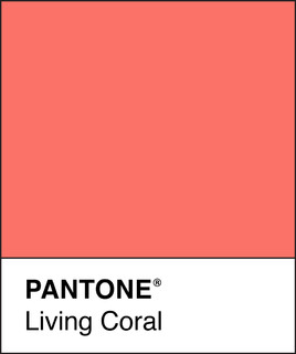
Color management company Pantone Color Institute announced its pick for Color of the Year for 2019, and it’s an eye-popping orange-pink hybrid called Living Coral. My initial reaction to Living Coral was that I prefer this color in the natural world and not in my home or wardrobe. But I do appreciate its boldness, so I set out to find successful uses of the new “it” color on Houzz.
Pantone describes Living Coral as “an affable and animating shade whose golden undertone gives it a softer edge.” I don’t find Living Coral particularly soft, and if I’m going this bold to decorate a client’s home, I prefer a true orange or even a hot pink. But if you’re loving this trendy color, here are seven places to use it in your home and yard.
Read more: https://www.houzz.com/ideabooks/116393119/list/are-you-a-fan-of-pantones-2019-color-of-the-year

 = new reply since forum marked as read
Highlight:
NoneDon't highlight anything
5 newestHighlight 5 most recent replies
= new reply since forum marked as read
Highlight:
NoneDon't highlight anything
5 newestHighlight 5 most recent replies

The Velveteen Ocelot
(129,762 posts)or major pieces of clothing. Nice color for a sofa pillow or a scarf, though.

TexasTowelie
(126,297 posts)The color would draw out any pink or red that someone has in their complexion. I don't think that it would look good on any complexion.
I think that Pantone struck out on this one because even when they chose colors that could be considered as "accent colors" it was still possible for them to be used in fashion as we would sometimes see on Project Runway. I don't see this color being suitable for much more than a blouse (maybe in satin) under a jacket or for a pair of shoes, rather than creating a complete outfit.

mrs_p
(3,232 posts)Wouldn’t work for our house (I would have to change the whole color scheme) but I may daydream a little about it.

Mars and Minerva
(369 posts)
liberal N proud
(61,180 posts)
sprinkleeninow
(22,194 posts)TT,
Thoughts of you this night. My wish: A Brand New Year With Everything Good Be Yours! 🎉🎆
💙
TexasTowelie
(126,297 posts)I have the place to myself tonight since my brother is running a fireworks stand this year. Happy New Year to you also.
sprinkleeninow
(22,194 posts)Hoyt
(54,770 posts)cream and coral.
mahina
(20,528 posts)TexasTowelie
(126,297 posts)It's just that I doubt that we are going to see a lot of dresses of this color on the red carpet. I hope that your outfit looks flattering on you. 
mahina
(20,528 posts)Hey happy 2019 TT
https://goo.gl/images/qW2Avm
Me.
(35,454 posts)those colors, coral, pink & orange are the 2019, Chinese year of the Earth Pig colors
Demit
(11,238 posts)TexasTowelie
(126,297 posts)Demit
(11,238 posts)But the colors "coral" and "salmon" are not objective phenomena. I imagine if you put a chunk of coral reef next to a salmon filet you would detect a color difference. But even then it depends on what kind of coral and what kind of salmon (and what kind of light you are viewing them in).
Color, and our perception of it, is dependent on many more factors than what a paint manufacturer or lipstick maker—or a color company in a yearly promotion to hype its brand—names its products. Color in real life is subjective.
If you are a designer, or a decorator, you know that.

Auggie
(32,998 posts)
NathalieBou
(7 posts)I really don't like it for home design, but I think it could be a great color to integrate on on website design. As they said, it a peaceful color and it has beed choosen in order to calm people anxiety caused by the social media, advertising, etc.