The Totally Unfair And Bitterly Uneven 'Recovery,' In 12 Charts - HuffPo [View all]
The Totally Unfair And Bitterly Uneven 'Recovery,' In 12 Charts
Mark Gongloff, Jan Diehm, & Katy Hall - HuffPo
9/13/13
<snip>
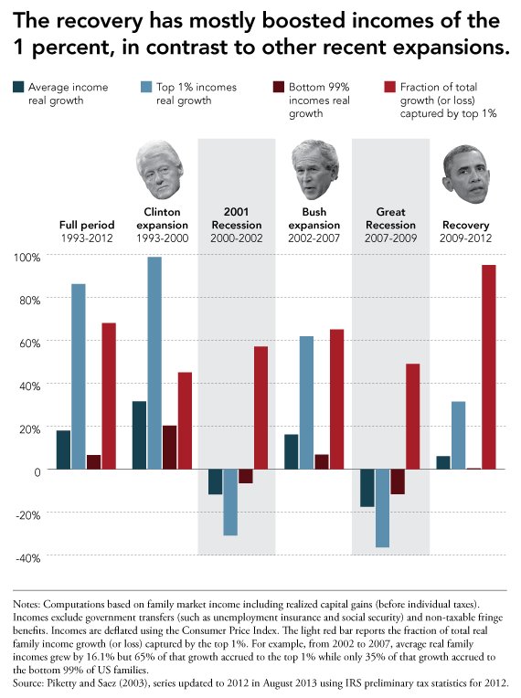
The financial crisis was hell for pretty much everybody, rich or poor. But the recovery that has followed has not been nearly as fair.
Wall Street, the wealthy and the powerful have done amazingly well since the crisis ended. Little of that has trickled down to everybody else, in what has been the most uneven recovery in at least several decades.
How about some charts to illustrate this infuriating result?
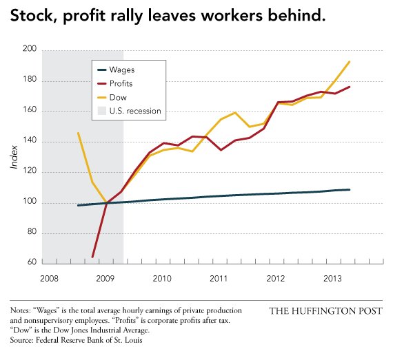
1. The first sad chart might tell most of the story. It tracks the growth in corporate profits, the Dow Jones Industrial Average and average hourly wages of the typical worker since the crisis. To quote Sesame Street, one of these things is not like the others, one of these things just doesn't belong. (Hint: It is your pitiful wages.)
<snip>
More:
http://www.huffingtonpost.com/2013/09/13/uneven-financial-crisis-recovery-charts_n_3913882.html

 = new reply since forum marked as read