General Discussion
In reply to the discussion: Here's the thing - don't expect me to be enthused about someone who cozys up to a mass murderer. [View all]
It shows to me a few things:
1) Whomever approved it has absolutely no esthetics, instinct, or experience and should be immediately fired. Everything you said about it is absolutely true. Unless they wanted to use it for an app, I have no idea how they felt this flat, static logo would translate across all media.
2) They thought they were too clever by half, mixing red and blue to appeal to both sides, but oops, the big red arrow is the thing that stands out. Moving to the right, and in no real proportion to the H. A copy of the Fed Ex logo? Perhaps, but without any of the subtle wit of that logo. (Also a right wing company that wants the USPS gutted and charges insane prices).
3) They didn't focus group the thing with Democrats. On the very first thread, people were pointing out the red arrow going to the right. One focus group of some left-leaning folks would have alrerted them. So I guess they don't want to hear from those people.
4) They have not learned from 2008. The Obama campaigned crushed them on graphics. It won the award for marketing of the year! To think that they once again don't value nor see the power in good graphics means they are woefully out of touch.
5) The fact that a two billion dollar campaign doesn't build into their early budget for good graphics means they don't think talent is worth anything. That is a huge problem and unfortunately will cost them exponentially.
Here's what people wanted on their cars in 2008

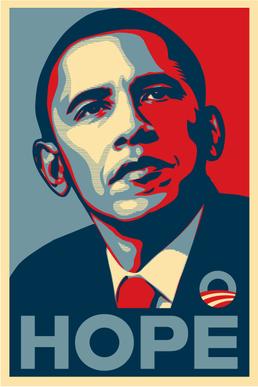
^^THAT is good graphics.^^
Edit history
Recommendations
0 members have recommended this reply (displayed in chronological order): = new reply since forum marked as read
Highlight:
NoneDon't highlight anything
5 newestHighlight 5 most recent replies
RecommendedHighlight replies with 5 or more recommendations
= new reply since forum marked as read
Highlight:
NoneDon't highlight anything
5 newestHighlight 5 most recent replies
RecommendedHighlight replies with 5 or more recommendations