Environment & Energy
Showing Original Post only (View all)Actual Carbon Emissions vs. IPCC Scenarios - how far away is safety? [View all]
I've been learning a lot about the IPCC emissions scenarios over the last couple of days. Just for grins I decided to do the plot below. It compares two IPCC scenarios against our actual global emissions from fossil fuels.
The scenarios I chose were:
A1T, which ends up with the world at +2 to +3 degrees Celsius in 2100; and
A1FI (FI stands for "Fossil Intensive" , which puts the world at +4 to +5 degrees C in 2100.
I plot our actual carbon emissions in red, and fit a polynomial trend line out to 2100. This is the "real" BAU scenario, so far.
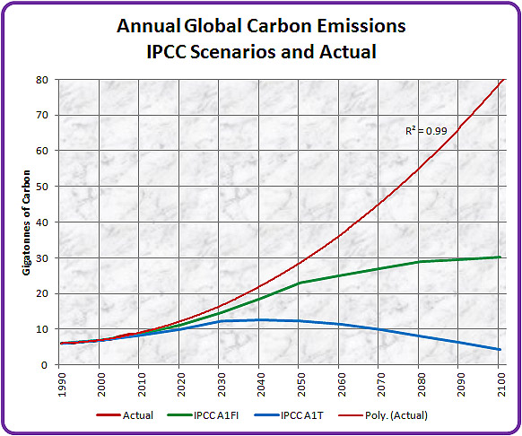
I'm not saying we'll get to 80 GtC per annum in 2100, I'm just using the comparison to point out how much correction we would need to do to get back down to a level that's merely extremely dangerous, let alone getting back to one that may (or may not) be reasonably safe.
Note that we are already above the emissions of both IPCC scenarios for 1990, 2000 and 2010 - and the gap is growing as expected.
The actual data is from the BP Statistical Review, the IPCC data is from the IPCC AR4.
 = new reply since forum marked as read
Highlight:
NoneDon't highlight anything
5 newestHighlight 5 most recent replies
= new reply since forum marked as read
Highlight:
NoneDon't highlight anything
5 newestHighlight 5 most recent replies