Environment & Energy
In reply to the discussion: Lying With Charts, Global Warming Edition [View all]
Nederland
(9,979 posts)I figured I would give you this in anticipation of you not approving of my choice of source. If you'd like to argue that Gavin Schmidt is a closet skeptic, I'm all ears 
Here is his chart comparing Hansen's 1988 computer models:
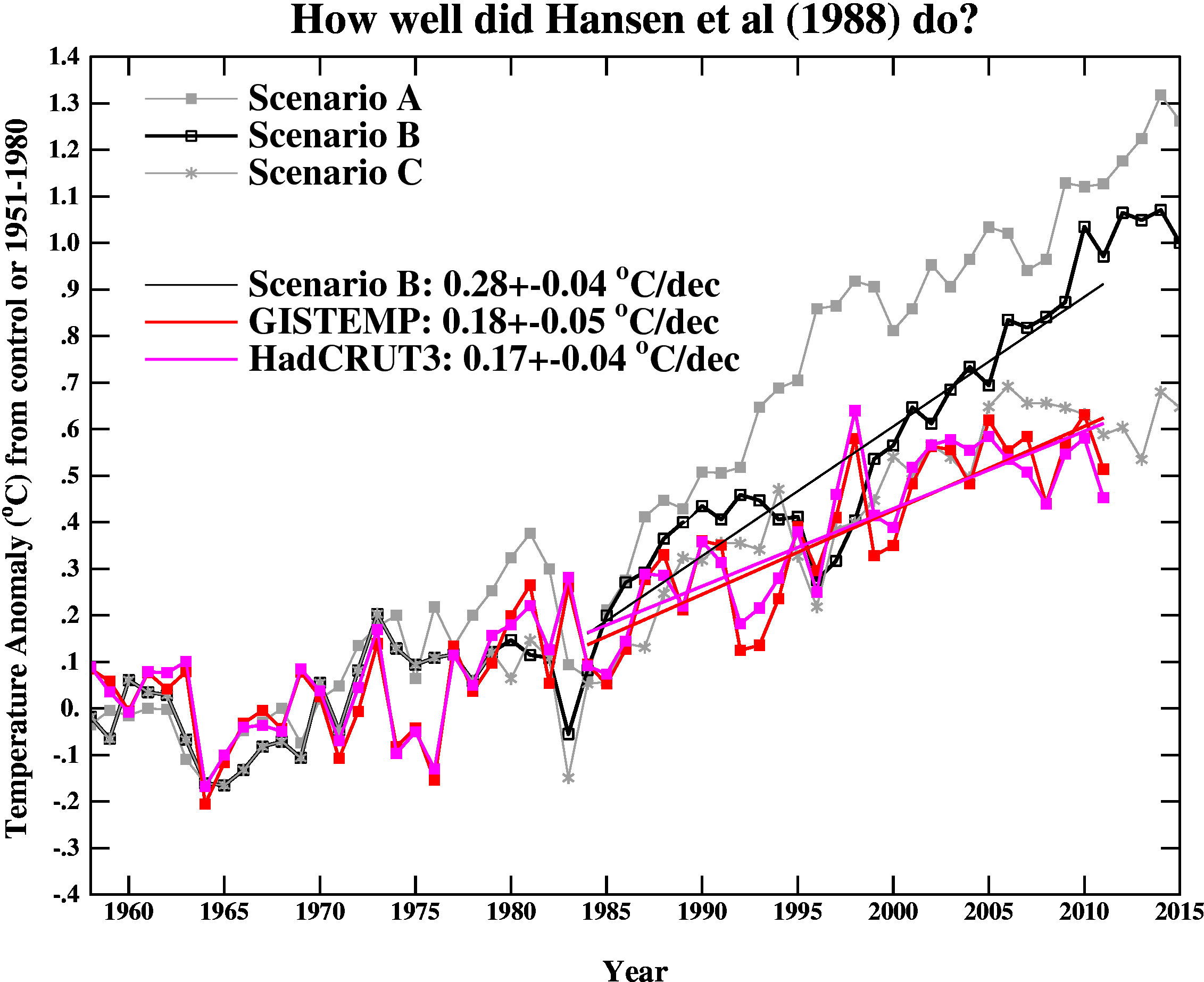
As you would expect, the model's ability to correctly predict temperature diminishes the further out you go. Hansen's description of what each scenario means is as follows:
Scenario A assumes continued exponential trace gas growth.
Scenario B assumes a reduced linear linear growth of trace gases.
Scenario C assumes a rapid curtailment of trace gas emissions after the year 2000.
Depending what is included in trace gases, Scenario A is the most accurate description of what has happened. Perhaps an argument could be made for choosing Scenario B, but one cannot plausibly claim that Scenario C occurred. Regardless, all of Hansen's prediction lines are now above observed temperatures. As time goes forward things will likely only get worse.
Here is his chart comparing AR4 models up through 2011:
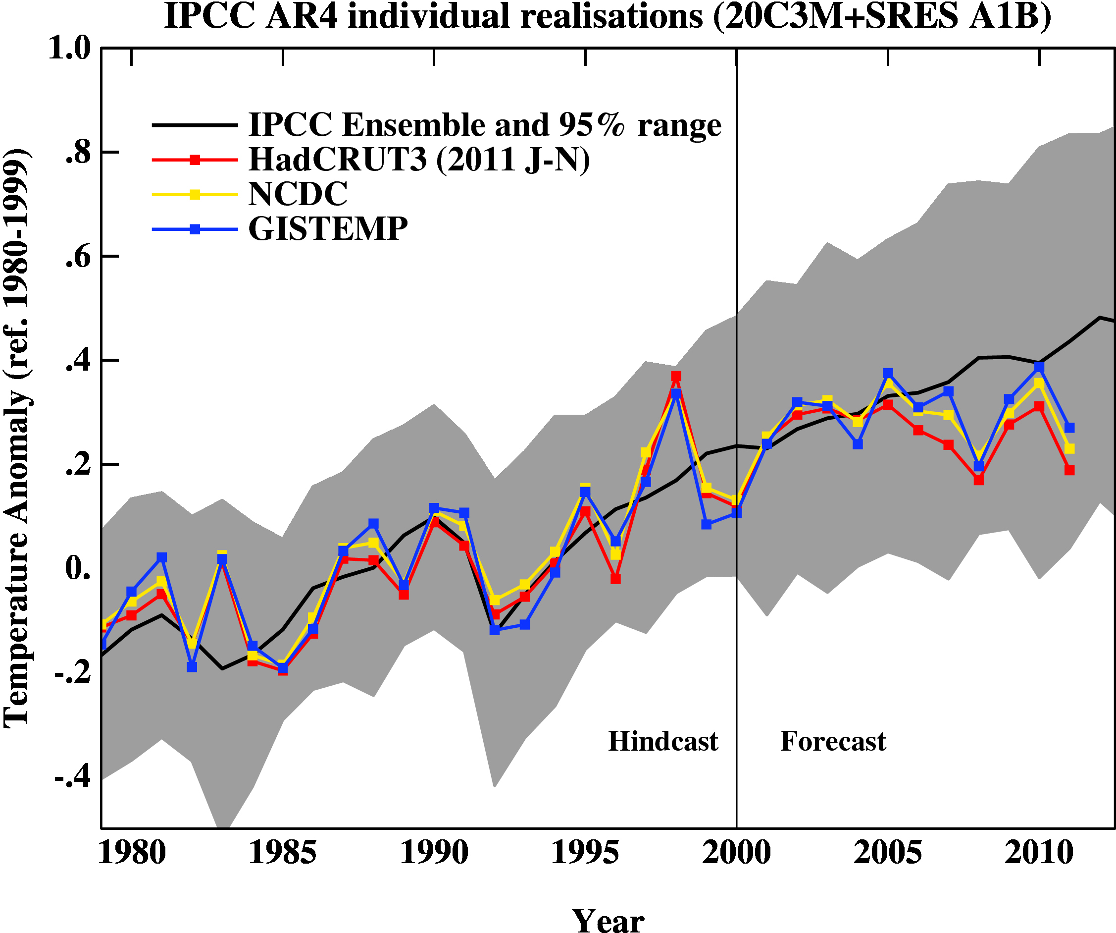
I'm not sure why the error bars on his graphs are so much larger than the ones on Lucia's, but I'm sure there will be endless discussions of which is right over the next few days (as of this posting, the RealClimate post is only two days old 2/8). Beyond the error bars though, the graphs look very similar, including the choice of baseline. The primary difference is that Lucia chose to display smoothed lines in her observed temperatures.
I would argue with Gavin's claim that everything from 2000 onwards should be considered a "forecast" simply because they used observed forcings up until 2000. What forcings were used as input data is not what is being displayed. What is being displayed is temperature, and obviously the temperatures up until 2006 were available for comparison to the modelers. The idea that modelers are such saints that they resisted the temptation to tweak their models until they matched these known temperatures fairly well is a little hard to believe. The fact that the predicted and observed temperature lines match up very well until 2006 and then suddenly diverge is a little more than suspicious.
Edit history
Recommendations
0 members have recommended this reply (displayed in chronological order): = new reply since forum marked as read
Highlight:
NoneDon't highlight anything
5 newestHighlight 5 most recent replies
RecommendedHighlight replies with 5 or more recommendations
= new reply since forum marked as read
Highlight:
NoneDon't highlight anything
5 newestHighlight 5 most recent replies
RecommendedHighlight replies with 5 or more recommendations