Environment & Energy
Showing Original Post only (View all)CO2 Emissions from Electrical Generation: 1980 to 2030 [View all]
The growing debate on electricity generation into the near future, the future roles of wind and nuclear power relative to fossil fuels, and the implications for CO2 emissions in the next couple of decades, got me curious to do a more thorough assessment of world electricity generation.
The purpose of this analysis is to investigate whether or not the adoption of industrial-scale renewable electricity that is now under way around the world is likely to reduce CO2 emissions over the next 20 years. In other words, I wanted to take (yet) another stab at placing renewable energy, especially wind power, in the larger context of electricity generation trends.
Actual Generation
Note: I didn't use "installed capacity" figures in this analysis, because my main interest is in electricity that either has been or may actually be generated. Installed capacity doesn't reflect these values well.
To begin a project like this, one needs numbers for the amount of electricity that has historically been generated by different sources - numbers that are widely accepted as accurate. For this data I went to the EIA. They maintain an easy-to-access database of the TWh that have been generated from different sources from 1980 until 2009 (and in some cases 2010). I used that data to derive the following graph:
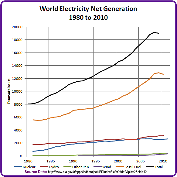
Figure 1. Actual Electrical Generation by Source (EIA)
Projected Generation
Next, I projected each of the sources out to 2030. To do this I applied various Excel trend lines to each source, choosing the trend line that gave the highest correlation coefficient. In the case of most sources the trend lines were second order polynomials.

Figure 2. Projected Electrical Generation by Source
Sanity Check
- For hydro power a linear projection worked well.
- For wind power, I started the trendline in 1990, in order to avoid the unrepresentative situation in the first 6 years of the data. This had the benefit of giving a higher end result in 2030.
- For nuclear power, the shape of the curve suggests that it could steadily lose ground over the next 20 years, falling to quite low levels by 2030. This may be confirmation bias on my part - I expect the use of nuclear power to be gradually phased out as plants age and new builds are cancelled or delayed.
- Wind could overtake nuclear power around the middle of the next decade, and never look back.
Next I needed to do a sanity check on my projections. For this I went to the IEA's WEO2008 publication which is a decade newer than the 1998 data used in previous posts on this topic. Here is their reference scenario projection to 2030:

Figure 3. Chart from WEO2008, page 143
Comparison of Actual Data
The EIA data for fossil fuel generation in 2009 is about 12,700 TWh.
The WEO2008 number is about 13,000 TWh.
The EIA data for all renewables in 2009 is 3,750 TWh, and for 2006 is 3,420 TWh.
WEO gives about 3,300 TWh in 2006.
The EIA and WEO numbers for actual generation are in fairly close agreement.
Comparison of Estimated Data
WEO2008 estimates that all renewables will generate over 7,700 TWh in 2030.
My projection for 2030 is 9,300 TWh. The difference is that I project 4,000 TWh of wind elctricity in 2030, compared to the WEO2008 estimate of under 2,000 TWh. My trending technique gives much more hope for the future of wind power than the IEA estimate does.
The WEO2008 estimate for fossil fuels is about 22,000 TWh.
My projection for fossil fuels is 24,000 TWh, about 9% higher than the WEO estimate.
Generation and Source Mix Over Time
The next two graphs give a decadal look at the changes in both the electricity generated by each source, and the proportion of electricity it supplies.
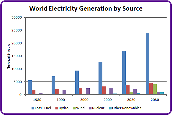
Figure 4. Projected Electrical Generation over Time

Figure 5. Projected Electrical Generating Mix over Time
This graphs clearly show wind replacing nuclear power as a significant generation source between 2020 and 2030.
Unfortunately, as wind and nuclear power trade off against each other, fossil fuels retain their 70% share of the constantly growing energy landscape.
Carbon Dioxide Emissions
As you would expect, under this scenario the amount of CO2 we generate will continue to grow into the foreseeable future.
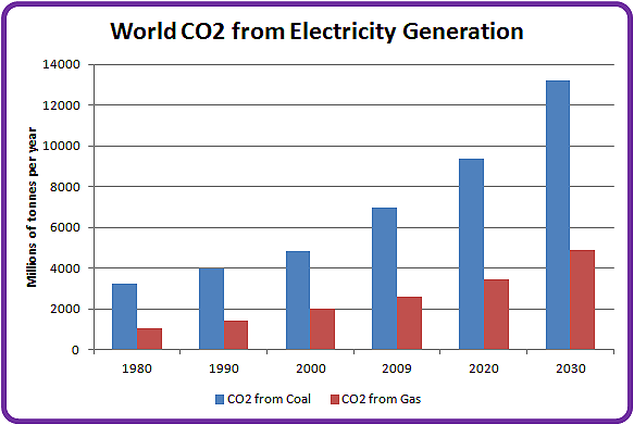
Figure 6. CO2 emissions from Thermal Electrical Generation
The assumptions I made for the CO2 projections in 2020 and 2030 include:
- A constant ratio of coal to gas generation. As is the case today, 55% of the electricity comes from coal and 45% from NG.
- Coal emits around 1 kg CO2/KWh; natural gas emits around .45 kg CO2/KWh. These numbers are within the range of various published measurements for life cycle CO2 emissions from coal and gas plants of various designs and vintages. The 2:1 spread implies that a large-scale global shift from coal to gas could help reduce emissions to some degree (while acknowledging the damage done by fracking...)
The main thing that jumped out at me is that the increasing use of wind power is unlikely to have any impact at all on CO2 emissions until after 2030 - and possibly not for another decade after that. This is because as we are increasing our wind power we are simultaneously dropping another low-GHG source (nuclear power, and good riddance to it!). In addition, the rising demand for electricity will outstrip our ability to build and install wind power over at least the next couple of decades, as shown by the diverging slopes of the fossil fuel and wind trend lines in Figure 2.
Conclusions
- If we stay on our current course without any radical deviations, renewable energy is unlikely to reduce the CO2 emitted by the world's electrical generation activities. If it does so, it will take a long time (30-50 years?) to make a significant difference. If we believe the current predictions of global warming, such a scenario is an ironclad guarantee of a +6 degree future.
- The only sure way to reduce CO2 emissions is to drastically reduce our fossil fuel consumption - not to squeeze it out of the market incrementally by replacing it with lower-cost wind, but to radically reduce the energy we get from that source. Unfortunately, unless something radical happens to the global economy, such a shift (say a drop to 50% of current levels in 20 years) is unlikely.
- This analysis doesn't take transportation issues into account. Over 70% of our oil is used in that sector.
- Only about 25% of our total CO2 emissions come from the electricity sector. Any improvements we make in this one sector are going to have marginal impact if other sectors (especially transportation and land use) are left unaddressed.
References:
EIA - Data: http://www.eia.gov/cfapps/ipdbproject/IEDIndex3.cfm?tid=2&pid=2&aid=12
IEA - WEO 2008: http://www.iea.org/textbase/nppdf/free/2008/weo2008.pdf
IEA - CO2 Emissions from Fuel Combustion, Highlights 2011: http://www.iea.org/co2highlights/co2highlights.pdf
 = new reply since forum marked as read
Highlight:
NoneDon't highlight anything
5 newestHighlight 5 most recent replies
= new reply since forum marked as read
Highlight:
NoneDon't highlight anything
5 newestHighlight 5 most recent replies