progree
progree's JournalHere is the admin's own numbers on the inflation situation
TLDR version: Year-over-year inflation has been rising for 5 straight months and is now at 3.0%, which is 1.5 X the Federal Reserve's 2% target. And in the last 3 months, prices have increased 0.9% which annualizes to a 3.6% inflation rate, which is 1.8 X The Federal Reserve's target. Here is the official data /END TLDR
CPI (seasonally adjusted)
https://data.bls.gov/timeseries/CUSR0000SA0
At the top right, click on More Formatting Options
On the left are some check boxes. Besides the "Original Data Value" one which is already checked,
Check the 1-Month Percent Change and the 3-Month Percent Change and the 12-Month Percent Change checkboxes
Then click the "Retrieve Data" button.
On the one month change one, there were no negative inflation months since May 2020, except April 2025 (-0.1%), which was followed by +0.2% the following month. So since May 2020, prices have overall on average been increasing every month except for one slight one-month dip, which was reversed the following month and then some.
As for peak inflation on a year-over-year basis (the bottom table and graph, repeated just below, this is the 12-month one), that was June 2022 at 9.0% (going all the way back to January 2015, the default start date of the graph and tables).
If you set the start date all the way back to 1970, the peak year-over-year inflation was 14.6% in March and April of 1980.
Year-over-year inflation has been climbing for 5 straight months, and is now at 3.0%. So if you're hearing that inflation is coming down, no it's not. And this is from the admin's own numbers.
Here is the year-over-year (aka 12-month) CPI graph and table from January 2015 to September 2025 (the latest)

==========================================
I like the 3-month average as it's a more recent measure than the 12-month one, but more than a "one-off" single month data point. In the last 3 months (the middle table and graph, repeated below), prices increased 0.9%. That annualizes to about a 3.6% inflation rate (using the actual index values for the calculation, and taking into account compounding, it comes to 3.62%. And rising).
The 3 month rolling average, % change over 3 months:

These are percent increases over 3 months. To roughly annualize, multiply the numbers by 4
Graphs - 3 month average and month over month
both annualized, calculated using actual index values
Standard template words coming later when I update its table
It's not comforting to me at all that the last 3 months have averaged 3.6% (annualized) for both the CPI and the core CPI. The 3 month average is my favorite gauge of RECENT inflation. The 1 month number can be dismissed as a "one off", while the 12 month average (year-over-year) has too much old data in it to be considered a good measure of RECENT inflation -- half the months are March 2025 or older, for example. Four of the months are Biden-era months.
Regular CPI

Core CPI -- Regular CPI less food and energy

From the OP, 12 month aka year-over-year

Is Windows screwing up your background colors, e.g. Files Explorer is black, your taskbar is white
and it's driving you crazy, and you followed advice you found online to go to Windows Settings (WindowKey i or Windows Start leftside menu) and choose Personalization -- > colors - > and change from dark to light or choose custom colors and screw around with the dark and light settings
and it changes things but about a minute later, it reverts back or to something else?
I recently (Oct 16) did a Windows update and a PowerToys update and that's when the problem started
It turns out that PowerToys has a new app, called Light Switch,
Windows 11 can now automatically switch between light and dark modes. How to do it, Mashable, 10/16/25
https://www.msn.com/en-us/news/technology/windows-11-can-now-automatically-switch-between-light-and-dark-modes-how-to-do-it/ar-AA1OCduV
I found it 10/18/25 - Light Switch was On, I turned it Off.
Back to Personalization -> Colors -> I have it set to Dark, because I can't stand my taskbar being white. But File Explorer background is black, arggh, but I can live with it.
Anyway, my taskbar has been staying black as desired. If it continues to be stable, then I will explore Personalization -> Colors -> Custom Colors and fiddle around with the 2 light/dark settings to see if I can get File Explorer white, while keeping the taskbar black.
By the way, my system is Windows 10, and yes, I know that starting October 14, no more updates, so I'll have to sign up very soon for the updates extension (for a year).
CPI Graphs: 3 months, 1 month, and 12-month (year-over-year), regular and core
News report from the source: https://www.bls.gov/news.release/cpi.nr0.htm
CPI data series: https://data.bls.gov/timeseries/CUSR0000SA0
CORE CPI data series: http://data.bls.gov/timeseries/CUSR0000SA0L1E
I annualize everything to be comparable to each other and to compare to the Fed's 2% target
They are calculated using the actual index values, not from the rounded off monthly change numbers.
The CPI rise averaged 3.5% over the past 3 months on an annualized basis (core CPI: 3.6%)
The August one month increase annualized is: CPI: 4.7%, (core CPI: 4.2%)
The 12-month average (year-over-year) increase is: CPI: 2.9%, (core CPI: 3.1%)
REGULAR CPI

CORE CPI

Both the CPI and Core CPI 3 month rolling average were hurt when the small May increase dropped out of the 3-month window
The Year - over - year CPI and Core CPI from the OP
So that all the graphs are together

The 12 months averages were hurt by last year's relatively small August 2024 month-over-month increases dropping out of the 12 month window. What drops out of the window is just as important as what enters the 12 month window (which is the latest, August 2025).
Some featured items from the BLS news summary https://www.bls.gov/news.release/cpi.nr0.htm
Increases in August over July:
Shelter: +0.4%, Energy: +0.7% (was -1.1%), Gasoline: +1.9% (was -2.2%),
Food: 0.5% (was 0.0%) and food at home: +0.6% (was -0.1%),, Food away from home: +0.3% (was +0.3%)
The "was" numbers in ( )'s are July over June
In most of these, it was like the August increase is making up for the July decreases or very small increases
12 month increases:
Energy: +0.2%, Food: +3.2%
Graphs 3 month rolling average and month by month.
Just for a quick look at the graphs. I'm still working on the blah blah part
I'm not a big fan of the PCE, because it is a chained price index. It all boils down to is that it includes the effects of consumers switching to lower grade items, so, for example if in the face of high beef prices, consumers switch to chicken and beans, that lowers the reported meat and food PCE inflation numbers. (The reverse also happens too)
For that reason, I prefer the CPI, which has less of that.
But the PCE, especially the Core PCE, is what the Fed favors, so anyone trying to predict what the Fed might do needs to focus on the Core PCE, and not the CPI measures
The Fed favors the CORE measures for forecasting FUTURE inflation, as shown by analysis of the data.
I annualize them all to be easy to compare to each other, and to compare to the FED's 2% goal. I use the actual index values rather than the one-digit changes that are commonly reported in the media. Links to the data are with the graphs.
ALL the numbers are the seasonally adjusted ones
In below, "REG" is the regular PCE (all items).
While "CORE" is the Core PCE (all items less food and less energy)
REG CORE
--- ----
2.4% 3.3% June to July change, annualized
2.6% 3.0% 3 month average, annualized
2.6% 2.9% 12 month average, aka year-over-year
Fed target is 2.0%
REGULAR ALL ITEMS PCE
BEA.gov News release: https://www.bea.gov/ and click on "Personal Income and Outlays" or "Personal Income"
https://www.bea.gov/news/2025/personal-income-and-outlays-july-2025
https://fred.stlouisfed.org/series/PCEPI

CORE PCE:
https://fred.stlouisfed.org/series/PCEPILFE

=====================================================
For comparison purposes, here are the CPI graphs
REGULAR ALL ITEMS CPI (released 8/12/25)
https://www.bls.gov/news.release/cpi.nr0.htm
https://data.bls.gov/timeseries/CUSR0000SA0

CORE CPI (released 8/12/25):
http://data.bls.gov/timeseries/CUSR0000SA0L1E

LBN thread on CPI inflation, 8/12/25:
https://www.democraticunderground.com/10143511498
GRAPHS (words still in progress)
The values in the graphs are calculated using the actual index numbers, not from the rounded-off-to-a-single-digit monthly changes.
The annualization calculations also takes into account compounding.
As an example, the reported 0.9% increase for the PPI in July -- someone downstream annualized that by simply multiplying that number by 12 to get 10.8%
In contrast, I put in the index numbers from http://data.bls.gov/timeseries/WPSFD4 into my spreadsheet (via copy and paste).
June: 148.270
July: 149.671
% change: +0.9448978%
1.009448978^12 = 1.1194700 , then subtract 1 and multiply by 100% = 11.95%
So 11.95%.
Simply multiplying the 0.9448978% by 12 yields 11.34%
So the compounding added 0.61 percentage points to it
PPI

Core PPI (PPI less food, energy, and trade services)
I use the Core PPI less food, energy, and trade services because that's what the BLS highlights (and that was true pre-Krasnov too), so I am doing likewise. The idea of the core is to remove the volatile components that bounce up and down a lot from month to month, so that's another reason to use the core PPI less food, energy, and trade services to project FUTURE inflation trends, and that's why the Fed focuses on core measures.

12 month graphs from OP. The graph's labeling says the core is PPI less food, energy, and trade services

PPI http://data.bls.gov/timeseries/WPSFD4
Core PPI (wo food, energy, trade services) http://data.bls.gov/timeseries/WPSFD49116
Core PPI (wo food & energy) http://data.bls.gov/timeseries/WPSFD49104
You can see graphs at the above links too -- chose More Fomatting Options at the upper right of the page and then check boxes like 1 Month, 3 Month, 12 Month

Probably has a similar wide-eyed reaction to today's numbers.
Graphs - not a bad CPI but a hot Core CPI . Very different graphs.
News report from the source: https://www.bls.gov/news.release/cpi.nr0.htm
CPI data series: https://data.bls.gov/timeseries/CUSR0000SA0
CORE CPI data series: http://data.bls.gov/timeseries/CUSR0000SA0L1E
I annualize everything to be comparable to each other and to compare to the Fed's 2% target
They are calculated using the actual index values, not from the rounded off monthly change numbers.
The CPI rise averaged 2.3% over the past 3 months on an annualized basis (core CPI: 2.8%)
The July one month increase annualized is: CPI: 2.4%, (core CPI: 3.9%)
REGULAR CPI
CORE CPI
Both the CPI and Core CPI 3 month rolling average were helped when the large April increases dropped out of the 3-month window
The Year - over - year CPI and Core CPI from the OP
So that all the graphs are together

The 12 months averages were hurt by last year's small July 2024 month-over-month increases dropping out of the 12 month window. What drops out of the window is just as important as what enters the 12 month window (which is the latest, July 2025).
Some featured items from the BLS news summary https://www.bls.gov/news.release/cpi.nr0.htm
Increases in July over June:
Shelter: +0.2%, Energy: -1.1%, Gasoline: -2.2%,
Food: 0.0% and food at home: -0.1%, (I know, I know), Food away from home: +0.3%,
12 month increases:
Energy: -1.6%, Food: +2.9%
Graphs - rolling 3 month average and month-over-month, both annualized
News report from the source: https://www.bls.gov/news.release/cpi.nr0.htm
CPI data series: https://data.bls.gov/timeseries/CUSR0000SA0
CORE CPI data series: http://data.bls.gov/timeseries/CUSR0000SA0L1E
I annualize everything to be comparable to each other and to compare to the Fed's 2% target
They are calculated using the actual index values, not from the rounded off monthly change numbers.
The CPI rise averaged 2.4% over the past 3 months on an annualized basis (core CPI: 2.4%)
The June one month increase annualized is: CPI: 3.5%, (core CPI: 2.8%)
REGULAR CPI

CORE CPI

Both the CPI and Core CPI 3 month rolling average were helped a lot when the huge January increases dropped out of the 3-month window, and were hurt a lot when the March decrease for the CPI and the tiny increase for the Core CPI dropped out of the window.
The rolling 12 months averages graphs are in the OP. They were hurt by last year's very small June 2024 month-over-month increases dropping out of the 12 month window. What drops out of the window is just as important as what enters the 12 month window (which is the latest, June 2025).
Some featured items from the BLS news summary https://www.bls.gov/news.release/cpi.nr0.htm
Increases in June over May:
Shelter: +0.2%, Energy: +0.9%, Gasoline: +1.0%, Food and food at home: +0.3%, Food way from home: +0.4%,
12 month increases:
Energy: -0.8%, Food: +3.0%
Bar graph of increases and decreases of various CPI components arranged from highest increase to lowest and then decreases, 12 month numbers (year-over-year)
https://finance.yahoo.com/personal-finance/banking/article/june-inflation-breakdown-consumers-feel-the-pinch-with-tariffs-looming-181129115.html
Household energy +7.1%
Auto insurance: +6.1%
Housing: +4.0%
Restaurant meals: +3.8%
. . .
Hotel rooms: -2.5%
Electrionics: -3.3%
Airfare -3.5%
Gasoline: -8.3%
And U.S. electricity generation was flat for so long, e.g. 2023 was about the same as 2007 (16 years).
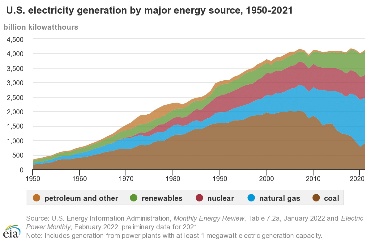
Edited: looking for something later, I found statista in archive.org but the latest figures are just through 2023:
2005: 4,055, 2010: 4,125, 2011:4,100, 2015: 4,078, 2016: 4,077, 2017: 4,034, 2018: 4,178, 2019:4,128, 2020: 4,007, 2021: 4,116, 2022: 4,243, 2023: 4,178 -- so note that 2023 is the same as 2018, so we're essentially talking about a flat spot from 2007 thru 2023 (16 years) /EDIT
It was during those flat years where the carbon emissions from electricity generation went down in the U.S., thanks mostly to natural gas replacing a lot of coal (natural gas is filthy, but only half as filthy as coal as far as greenhouse gas emissions per KWH). And thanks to solar and wind. And finally, that electricity generation and consumption was essentially flat was helpful.
Well, now electricity growth is expected to skyrocket as multiple sources say, it will be next to impossible to keep greenhouse gas emissions from growing at least for the next few years if 25% growth in electricity in just 5 years were to occur.
As for air conditioning load, that is expected to skyrocket too. A small rise in average temperature results in an exponential increase in very hot days:

The graph illustrates that a small shift to the right in the average shifts the whole bell curve to the right, and, in this illustration makes hot weather (orange) much more common and extreme hot weather (red) from almost zero probability to considerable probability
Much more at link: https://www.democraticunderground.com/10143266574#post1
======================================================
Why your air conditioning bill is about to soar - the energy required rises with the SQUARE of the temperature difference
https://www.democraticunderground.com/1127174891
Graphs - rolling 3 month average and month-over-month, both annualized
News report from the source: https://www.bls.gov/news.release/cpi.nr0.htm
CPI data series: https://data.bls.gov/timeseries/CUSR0000SA0
CORE CPI data series: http://data.bls.gov/timeseries/CUSR0000SA0L1E
I annualize everything to be comparable to each other and to compare to the Fed's 2% target
They are calculated using the actual index values, not from the rounded off monthly change numbers.
The CPI rise averaged 1.6% over the past 3 months on an annualized basis (core CPI: 2.1%)
The April one month increase annualized is: CPI: 2.7%, (core CPI: 2.9%)
REGULAR CPI

CORE CPI

Both the CPI and Core CPI 3 month rolling average were helped a lot when the huge January increases dropped out of the 3-month window.
The rolling 12 months averages graphs are in the OP. They were helped by last year's big April 2024 month-over-month increases dropping out of the 12 month window. What drops out of the window is just as important as what enters the 12 month window (which is the latest).
Next month, the rolling 12 month average will not be helped by the "drop out" effect because May 2024 month-over-month increases that are dropping out of the 12 month windows are small: just 0.5% ANNUALIZED for the CPI, and 1.7% ANNUALIZED for the core CPI.
Profile Information
Gender: MaleHometown: Minnesota
Member since: Sat Jan 1, 2005, 03:45 AM
Number of posts: 12,812