progree
progree's JournalI hope they don't have a lot of the South African variant there
the AstraZeneca vaccine ... is a massive fail against the B.1.351 South African variant running riot in many places. It only has a 10.4% efficacy rate v B.1.351.
according to New England Journal of Medicine
https://www.democraticunderground.com/?com=view_post&forum=1002&pid=15441803
YouTube: Man Schools A Cop That Detained Him For Parking On A Public Street
My (Progree) short description of what I saw -- He's sitting in a car parked across the street from a house in North Branch, Minnesota. A woman in that house called 911 about a suspicious person taking pictures, and so this cop showed up. The driver simply refused to show his license and registration or answer any questions because the cop didn't have a valid reason to detain him. All the cop could say about that is that they got this suspicious person call and he was finding out what was going on. The driver (he self-describes as a "colored person" at 2:30. ) said he has a legal right to sit on the street and take pictures 24/7 (though he said he wasn't taking pictures, he merely had a cellphone on a dashboard mount). And he asked the cop to identify himself which the cop finally did. The driver told him this is going to be on Facebook, YouTube and I forget what else. The cop did start to sound like he was about to cry when he left.
Oh, at 6:50 the cop said "I'm smelling an odor coming from your car", Driver said: get your puppy then. (more than once).

An earlier GD thread about it: https://www.democraticunderground.com/100215390073
Protesters Clash With Police In Brooklyn Center After Deadly Officer-Involved Shooting (MN)
Source: WCCO-TV (CBS affiliate Minneapolis)
Brooklyn Center police say an officer fatally shot a driver Sunday, leading to some clashes between protesters and law enforcement. Here are the latest updates:
9:49 p.m.: The standoff continues outside of the Brooklyn Center Police Department between protesters and law enforcement.
Brooklyn Center police said officers pulled over a driver they said had an outstanding arrest warrant, just before 2 p.m. on the 6300 block of Orchard Avenue. As officers were trying to arrest the driver, police say they tried to get back inside their vehicle. An officer then shot the driver, who then drove a couple blocks more before hitting another vehicle in the area of 63rd Avenue North and Kathrene Drive. No one in that second vehicle was hurt. The driver was pronounced dead at the scene. Police say the officers involved were believed to be wearing activated body cameras at the time of the shooting.
The victim’s mother, Katie Wright, spoke to the crowd. She said her son — 20-year-old Daunte Wright — had been killed by police. She said Wright’s girlfriend was in the car with him at the time of the traffic stop. Police say that woman suffered non-life threatening injuries in the crash, and was taken to North Memorial Health.
Read more: https://minnesota.cbslocal.com/2021/04/11/bca-reporting-to-officer-involved-shooting-in-brooklyn-center/
More background at the article. It is being continuously updated.
Yes, the fatally shot driver is Black.
For non-Minnesotans, Brooklyn Center is the first suburb north of Minneapolis. Minneapolis is of course the city where George Floyd was murdered by then Minneapolis police officer Derek Chauvin, who has been on trial for the past 2 weeks.
Cross-posted at Minnesota Group https://www.democraticunderground.com/105910260
Brooklyn Ctr, MN Police pulled over black driver, fatally shot him, protesters tear-gassed
https://minnesota.cbslocal.com/2021/04/11/bca-reporting-to-officer-involved-shooting-in-brooklyn-center/The story is being continuously updated
9:24 p.m.: A WCCO crew spotted several law enforcement vehicles, including Hennepin County Sheriff’s vans and armored trucks, headed towards the Brooklyn Center Police Department.
9:14 p.m.: Law enforcement are forming a human barricade outside of the Brooklyn Center Police Department, as more protesters gather.
8:19 p.m.: A WCCO crew at the scene is being told by activists that law enforcement is surrounding the area and “corralling” people in an apparent attempt to make mass arrests, like what happened last November during a protest that spilled onto Interstate 94 in Minneapolis.
8:01 p.m.: Protesters are continuing to push law enforcement back.
7:59 p.m.: Law enforcement has deployed tear gas into the crowd of protesters.
For non-Minnesotans, Brooklyn Center is the first suburb north of Minneapolis. Minneapolis is of course the city where George Floyd was murdered by then Minneapolis police officer Derek Chauvin, who has been on trial for the past 2 weeks.
https://twitter.com/JasonDMyles/status/1381410717094526982
Yes, the fatally shot driver is Black.
Cross posted at Latest Breaking News - https://www.democraticunderground.com/10142727465
'A sigh of relief': Crowdfunded cab rides aim to get Asian Americans home safe
NPR, 4/9/21
--snip--
In response to recent attacks against Asian Americans, community-based efforts in the San Francisco Bay Area, New York and Boston are pooling funds for taxi or app-based rides for Asian Americans and Pacific Islanders who feel unsafe walking or taking public transit.
Over the last month alone, Asian Americans have been attacked at work, on the way to church, and while waiting to cross the street. In a widely-cited report, the organization Stop AAPI Hate said it received close to 3,800 reports of incidents ranging from verbal harassment to physical assault from last March to this February.
Candy said her fears worsened last month, after a shooter in Atlanta killed eight people, including six Asian women.
--snip--
"I started thinking about all my student days when I couldn't afford to take cabs and I chose to take the train or walk, even if it was late at night, just to save money," Park said. "I thought, there must be so many people who can't afford these car rides that might be putting themselves at risk."
--snip--
By Thursday, Cafe Maddy Cab had reimbursed at least 400 of more than 1,000 requests. Park said many of the requests have come from nurses, medical personnel and other essential workers who often work night shifts. She's also received messages from people escorting older relatives to COVID-19 vaccinations and doctor appointments.
More: https://www.mprnews.org/story/2021/04/09/npr-a-sigh-of-relief-crowdfunded-cab-rides-aim-to-get-asian-americans-home-safe
=====================================
It's sad that it's come to this. With hate-mongering Trump (and Trumpsters) vigorously fanning the flames -- "China Flu", "Kung Flu".
Cross-posted Asian Group
https://www.democraticunderground.com/12507979
Republican congressman condemned over Islamophobic tweet to Ilhan Omar
The Guardian, April 5, 2021
A police officer was killed when a suspect rammed him and another officer with his car outside the Capitol on Friday. The suspect wielded a knife and was shot dead. The other officer hit by the car survived.
....................
Omar, a Minnesota Democrat, tweeted: “Heartbroken to learn another [police officer] was killed while protecting the Capitol. My thoughts and prayers go out to the officer’s family and the entire Capitol police force. The death toll would have been worse if the assailant had an AR-15 [assault rifle] instead of a knife.”
In response, Congressman Greg Murphy of North Carolina wrote: “Would have been worse if they had been flying planes into the buildings also.”
Omar, who came to the US from Somalia as a child, is one of the first two Muslim women to be elected to Congress.
Murphy was widely rebuked. ..................................
Emphasis added by Progree.
It just never ends.
Rep. Murphy, it would be nice too if they regulated who can buy and carry guns with the same thoroughness they use to keep people with weapons and dangerous backgrounds (background checks) out of planes and to secure the cockpits.
How the COVID relief bill could help reshape the finances of American families
Various excepts
Included in President Joe Biden's $1.9 trillion relief package is a provision that provides many American parents an allowance of $250 a month for each child and $300 for kids under 6.
Although set to last only through this year, ...
The federal government already offered a limited tax break for parents, but the new law expands that in a number of important ways.
First, it vastly expands the amount of money provided to families — 50 percent to 80 percent more for each child.
Second, it's designed to be given out monthly, like an allowance, rather than just once a year.
And third, parents with little or no income still qualify for the full amount.
That's a departure from the existing tax break, which is less generous to low-income workers and gives the poorest families nothing at all.
"This is landmark legislation that would really slash child poverty and target benefits to the lowest-income families that need them the most," says Kris Cox, deputy director of federal tax policy at the left-leaning Center on Budget and Policy Priorities.
Congressional Democrats are already hoping to make the child subsidy payment permanent. Extending the child subsidy would cost about $100 billion a year.
MORE: https://www.mprnews.org/story/2021/03/14/npr-how-the-covid-relief-bill-could-help-reshape-the-finances-of-american-families
Tags: $1.9 Trillion Stimulus, ARPA 2021, American Rescue Plan Act of 2021
Why scientists are very worried about the variant from Brazil (very depressing)
... for some scientists, the most worrying variant [of all the variants that have emerged around the world in the last several months] might be the newest one. A variant called P.1, which emerged in early December in Manaus, Brazil, and by mid-January had already caused a massive resurgence in cases across the city of 2 million people.
On Monday, officials detected the first confirmed case of P.1 in the U.S., specifically in Minnesota.
"If you were to ask me right now, what's most concerning of all the things that I've heard so far, it's the fact that they are reporting a sudden increase in cases in Manaus, Brazil," virologist Jeremy Luban, at the University of Massachusetts, told NPR two weeks ago, before the variant arrived in the U.S. "Manaus already had 75 percent of people infected [in the spring of last year]."
... While the variant from the U.K. took about three months to dominate the outbreak in England, P.1 took only about a month to dominate the outbreak in Manaus. In addition, Manaus had already been hit extremely hard by the virus back in April. One study estimated that the population should have reached herd immunity and the virus shouldn't be able to spread easily in the community. So why would the city see an even bigger surge 10 months later?
(and then details about the variant and particularly several mutations on the surface that make it more effective. Very concerning details -Progree)
"We've been here before with the flu. We're having to live with influenza and figure out a way of staying ahead of the virus by making vaccines on a yearly basis," says Gupta, at the University of Cambridge.
"So I can imagine that we'll be doing something similar with coronavirus. Eventually we'll need to design different vaccines that are targeting different parts of the virus — ones that the virus finds harder to change."
MORE: https://www.mprnews.org/story/2021/01/27/npr-why-scientists-are-very-worried-about-the-variant-from-brazil
Manaus is also the city that's been in the news for running out of oxygen supplies.
Restaurants, bars scramble for propane amid pandemic winter (for outdoor dining)
AP, January 16, 2021
It's one of many new headaches — but a crucial one — that go with setting up tables and tents on sidewalks, streets and patios to comply with public health restrictions.
“You’re in the middle of service and having staff run up and say, ‘We’re out of propane!’" said Melinda Maddox, manager of a whiskey tasting room in Colorado.
Propane long has been a lifeline for people who live in places too remote to get natural gas piped to their homes for heat, hot water and cooking. This winter, 5-gallon propane tanks have proven a new necessity for urban businesses, too, especially in places like the Rocky Mountains, where the sun often takes the edge off the chill and people still enjoy gathering on patios when the heaters are roaring.
The standard-size tanks, which contain pressurized liquid propane that turns to gas as it's released, are usually readily available from gas stations, grocery stores or home improvement stores. But that's not always the case lately as high demand leads to sometimes erratic supplies.
More at: https://kstp.com/coronavirus/restaurants-bars-scramble-for-propane-amid-pandemic-winter/5979997/?cat=12685
I have no idea what all this adds up to as far as amount burned and GHG released. But it's obviously not very "green".
EDIT: I missed the stuff below the ad. e.g. "So far, the surge in demand for small-tank propane hasn't affected overall U.S. propane supply, demand and prices, which are running similar to recent winters, according to the U.S. Energy Information Administration."
But it does take time out of the day to hunt down more propane. Methinks too that this has been a mild winter so far.
Covid data links, revised 12/12/22
ABBREVIATIONS:7dma - 7 day moving average
Quick Links
Updates to this thread (e.g. new links and topics added) https://www.democraticunderground.com/114224534#post1
CDC's Community Levels map (Green, yellow, orange) U.S. map showing all counties
https://covid.cdc.gov/covid-data-tracker/#county-view?list_select_state=all_states&list_select_county=all_counties&data-type=CommunityLevels
CDC's Covid Data Tracker Weekly Review
https://www.cdc.gov/coronavirus/2019-ncov/covid-data/covidview/index.html
New York Times: U.S. States: https://www.nytimes.com/interactive/2020/us/coronavirus-us-cases.html
. . . Countries of the World: https://www.nytimes.com/interactive/2020/world/coronavirus-maps.html
OurWorldInData.org - Super Site for countries of the world, but doesn't have U.S. states https://ourworldindata.org/coronavirus
Covid Tracking Project: https://covidtracking.com/data
Worldometers: Countries of the world: For country population sizes and the covid situation in each country and the world overall
https://www.worldometers.info/coronavirus/
Worldometers: For U.S. states (and the U.S. overall)
https://www.worldometers.info/coronavirus/country/us
Positivity rates and testing rates and other metrics
https://coronavirus.jhu.edu/testing/tracker/overview
https://covidactnow.org/?s=1301312
https://coronavirus.jhu.edu/testing/individual-states
https://covidtracking.com/data
https://coronavirus.jhu.edu/testing/tracker/map/new-tests-per-100-k-people
Detailed page on positivity and test rates, describing the above pages, post#2 in this thread
The U.S. overall positivity rate, 7dma:
OurWorldInData.org - https://ourworldindata.org/coronavirus
https://coronavirus.jhu.edu/testing/individual-states
(one has to read it from the graph or hover the mouse just right)
U.S. overall testing rate:
OurWorldInData.org -- https://ourworldindata.org/coronavirus
https://covidtracking.com/data
(Some math required, see details in the "U.S. overall testing rate" section below.
Excess mortality - https://ourworldindata.org/excess-mortality-covid
Vaccination rates:
NPR: By state: has (#1#) fully vaccinated, and also (#2#) at least one dose by state: https://www.npr.org/sections/health-shots/2021/01/28/960901166/how-is-the-covid-19-vaccination-campaign-going-in-your-state
New York Times vaccination rates (no paywall, maps and tables galore)
https://www.nytimes.com/interactive/2020/us/covid-19-vaccine-doses.html
BeckersHospitalReview: By state: Number fully vaccinated, population, and percentage fully vaccinated
https://www.beckershospitalreview.com/public-health/states-ranked-by-percentage-of-population-vaccinated-march-15.html
There are a number of other sites that have added vaccination rates -- search below on "vaccin"
RESTRICTIONS, Shutdowns, lockdowns -- see section way below
Alternatives to New York Times
## CovidActNow: https://covidactnow.org/?s=1124253 -- the states are numbered in the listing so don't have to count them like the NYTimes
## Global Epidemics: https://globalepidemics.org/key-metrics-for-covid-suppression/ -- also numbers the states
## Reuters: https://graphics.reuters.com/HEALTH-CORONAVIRUS/USA-TRENDS/dgkvlgkrkpb/index.html -- it has mini-charts of all 50 states all on this page, but are not as much resolution as the New York Times ones
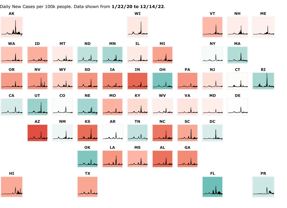
## John Hopkins 50 states' minicharts "map" page, alternative to the NY Times from John Hopkins University
The below "map" of the 50 states' minicharts (which are scaled by daily new cases PER CAPITA), is from the John Hopkins U.https://coronavirus.jhu.edu/data/new-cases-50-states
Purpose: Just to gather together some useful links in one place to check out the Covid situation in a state or country.
Particularly for a U.S. state, it is helpful to know more than just the number of cases (or hospitalizations or deaths), because for example, is 5,000 new cases for a particular state a terrible number or not compared to other states or the U.S. average?.
Helpful context to have so that it can fairly be compared to one's state, to other states and to the U.S. average :
Per Capita -- Often large states are bashed for having high case numbers. Fine. But it helps to provide what its per-capita numbers are and how it compares in that regard to the U.S. average and to other states, e.g. is it 15th best or 12th worst or about median or what.
7 day moving average (7dma). One day data is only marginally useful information. Testing and reported case results vary greatly by day of the week and also just day-to-day statistical volatility. This day-of-the-week effect and volatility varies from state to state. And sometimes days are reported that are actually a combination of 2 or more days and are presented as one day results - very misleading.
7 day moving averages get rid of the day-of-the-week problem. Every 7dma is an average of all 7 weekdays.
As an example of the day-of-the week effect, here is an example from Minnesota, written December 8 by Minnesota Public Radio's David Montgomery:
"Mondays are typically the days when the most people go get tested. And data from Mondays tends to show up on Thursdays and Fridays — since the beginning of September, on average about 10 percent of eventual cases are reported on Wednesday, 35 percent on Thursday, 23 percent on Friday, 13 percent on Saturday, and 16 percent on Sunday." ((Hmm, that totals 97%, meaning that only 3% are reported on Monday and Tuesday combined -Progree))
Daily new cases (as opposed to cumulative total since the pandemic began) -- Daily new cases (best: per capita and 7dma) tell us where the hotspots are NOW, not the states that had a rough spring or summer. (When I do want to look at cumulative totals since the beginning, I choose Worldometers for that (below) )
Trends - Are new cases increasing or decreasing, and how rapidly? I usually look at the mini-charts at the top of the New York Times page, and then click on a state for a detailed look and larger graphs, for example
U.S. with mini-charts for each state, all on one page:
https://www.nytimes.com/interactive/2020/us/coronavirus-us-cases.html
California as an example: https://www.nytimes.com/interactive/2020/us/california-coronavirus-cases.html
In a posting, realizing that fewer than 10% of the people click a link, I often present a mini-summary, e.g. this from a January 3 posting of Nevada:Daily new cases, 7 day moving average
https://www.nytimes.com/interactive/2020/us/nevada-coronavirus-cases.html
1173 July 20 -- the pandemic high point until early November
277 Sept 13 -- post summer peak low point
2727 Dec 9 -- pandemic peak
1896 January 2 - latest (down 30% from the peak).
This page currently focuses on cases, especially daily new cases per capita, 7dma in these links, because they are the leading indicator. Hospitalization rates and death rates tend to follow weeks after.
However, daily cases per capita in the data we see are reported cases. That in turn depends on the testing rate. Some states have relatively low testing rates and therefore, in general, relatively low reported case rates compared to those that do more testing. There is a special section below " Testing Rates (e.g. tests per day per capita), Positivity Rates" with that information.
Hospitalization rates, especially new admissions rates if available, are the next metric in the timeline that confirm that the situation is improving or worsening, and not just because of a change in testing rates. That and the trend in test positivity rates
DETAILS
New York Times
What's bad is that some people don't have access to the New York Times -- however do note that their coronavirus coverage is free and unlimited, but one has to sign up for that (they might have gotten rid of that requirement). In the many months I've used it, I've never been asked to sign in again.
. . . U.S. States:
https://www.nytimes.com/interactive/2020/us/coronavirus-us-cases.html
I love it for its mini-charts of all 50 states (they are by default drawn to the same scale per capita so that states can be compared). As well as the table where one can rank the states by NEW per capita cases, 7 day moving average.
Warning that testing rates affect the reported case rates, so states that test more may have worse looking case rates than states that test less, and so comparisons aren't fair.
. . . Countries of the World:
https://www.nytimes.com/interactive/2020/world/coronavirus-maps.html
Same comments as for U.S. States.
===############################################===
OurWorldInData.org - Super Site for countries of the world, but doesn't have U.S. states https://ourworldindata.org/coronavirus
This has positivity and also test rates -- for Positivity, choose the "Share of Positive Tests" radio button above the graph. For testing rates, choose the "Tests" radio button above the graph then 7-day rolling average and "Per 1,000 people" checkbox. Has views: Chart, Table, Map. Also can Download. Yes, the Tests per 1000 people 7dma in the chart match the table (the table show the latest day's info (7dma if that's what was selected) )
https://ourworldindata.org/coronavirus
## Excess mortality - https://ourworldindata.org/excess-mortality-covid
## Missing: U.S. states. It's "just" countries of the world.
===############################################===
Covid Tracking Project
CovidTracking: https://covidtracking.com/data
Good for U.S. overall statistics: Daily Tests, Daily Cases, Currently Hospitalized, Daily Deaths -- both for the most recent day, and the 7 day moving average. And Cumulative totals for all of the above (except hospitalization). All with graphs
Then followed by the above for each state. Some (most) have race & ethnicity statistics, long-term care facilities, viral (PCR) tests and antibody tests.
Unfortunately no graphs for the states.
But click on "Historical Data" links to see the daily numbers going all the way back.
===############################################===
Worldometers:
For country population sizes and the covid situation in each country and the world overall (with al the caveats below):
https://www.worldometers.info/coronavirus/
For U.S. states (and the U.S. overall)
https://www.worldometers.info/coronavirus/country/us
Vitally Important: the default "Now" button likely has incomplete and too small New Cases and New Deaths data. Better to click the "Yesterday" button or the "2 days ago" button to make sure to get complete case data for a day.
A sucky thing about Worldometers is that they don't have anything for new cases per 1M population or new deaths per 1M population. After clicking the "Yesterday" or "2 days ago" button as cautioned above, one has to do the math by dividing the New Cases (or New Deaths) by the population. And there's no way to sort the table by new cases per 1M population or new deaths per 1M population because these columns don't exist.
All of the per-capita stuff (Total cases/1M pop, Deaths/1M pop, Tests/1M pop) are cumulative totals since the pandemic began. To me, most of that is ancient history, and I usually care much more about what's been happening the last few days or weeks. But like I said above, New Cases and New Deaths are not given on a per capita basis).
Another caution about New Cases and New Deaths is (besides remembering to click the "Yesterday" or "2 days ago button" so as to get a full day rather than a partial day of information), is that the daily amounts fluctuate quite a lot from day to day with some high days being the result of unusual case backlogs being reported on one day, for example. I much prefer sites that present 7 day moving average so as to smooth out the day-to-day volatility, and to also capture an entire week so as not to get biased data for days of the week where there is usually low or high numbers such as weekends and Mondays etc.
Good things about Worldometers:
. . . Shows the populations
. . . Shows the U.S. overall on the listing of the U.S. states, and the world overall on the listing of countries. A lot of other resources don't do that simple common-sense thing, so that, for example to compare the infection rate of Illinois to the U.S. overall, one has to visit 2 pages, and sometimes can be hard to find.
===############################################===
Testing Rates (e.g. tests per day per capita), Positivity Rates, and other useful web pages with this information
https://www.democraticunderground.com/114224534#post2
===############################################===
Excess mortality - https://ourworldindata.org/excess-mortality-covid
===############################################===
RESTRICTIONS, Shutdowns, lockdowns:
New York Times, all states
. . . https://www.nytimes.com/interactive/2020/us/states-reopen-map-coronavirus.html
Midwest: Coronavirus-Related Restrictions By State, NPR, 12/3/20
. . . https://www.npr.org/2020/06/11/847413697/midwest-coronavirus-related-restrictions-by-state
NPR all states:
. . . https://www.npr.org/series/847328455/coronavirus-restrictions-in-each-state
===############################################===
Alternatives to New York Times
## CovidActNow: https://covidactnow.org/?s=1124253 -- the states are numbered in the listing so don't have to count them like the NYTimes
## Global Epidemics: https://globalepidemics.org/key-metrics-for-covid-suppression/ -- also numbers the states
## Reuters: https://graphics.reuters.com/HEALTH-CORONAVIRUS/USA-TRENDS/dgkvlgkrkpb/index.html -- it has mini-charts of all 50 states all on this page, but are not as much resolution as the New York Times ones
## John Hopkins 50 states' minicharts "map" page, alternative to the NY Times from John Hopkins University
The below "map" of the 50 states' minicharts (which are scaled by daily new cases PER CAPITA), is from the John Hopkins U.
https://coronavirus.jhu.edu/data/new-cases-50-states
-- at that page you can click on individual states on the "map". Showing 3-day moving average of new cases. I prefer the nytimes' charts which are 7 day moving averages). But I'm not sure how up to date the below .jpg image file is, so its better to click the ABOVE link (also the individual states on the above link are click-able to show more info on the states)
Tips
Tired of trying to move the mouse to the exact right position on a graph to read the data point box that pops up? e.g. to get the mouse on the peak point of the graph, or to get it on the last point on the graph --- Turn Mouse Keys on: On Windows 10, hit the Window Key, and type in Mouse Keys, and it will take you to the Settings to turn it on or off.
Also, very importantly, UNcheck the checkbox "Only use Mouse Keys when Num Lock is On"
Then when you want to use Mouse Keys, have NUM LOCK OFF, and use the cursor arrows on your numeric keypad to move the mouse cursor.
When you want to use the numeric keypad to type numbers, turn NUM LOCK ON.
Also I sometimes zoom in on a graph (Control + to zoom in, Control - to zoom out, Control 0 to reset to 100% zoom) in order to position the cursor just right, but that's been getting more and more difficult even when zoomed to the max, so I was glad to find that mouse keys work. Wish to heck they'd just link to their data table
Profile Information
Gender: MaleHometown: Minnesota
Member since: Sat Jan 1, 2005, 04:45 AM
Number of posts: 10,919